Meeting 14
Chi trova un amico trova un tesoro
Retouching issues, adding color to line art, Creative #2
| Exercise Folder | Filename |
| #1 | musicians.tif |
| #1 | fade down.tif |
| #1 | dort_stumChump_8256.dng |
| #3 | cans.tif |
| #4 | joe w dust.tif |
| #4 | luna night shots-19t.jpg |
| #6 | p_slimmed.psd |
The Healing Brush tool and the Patch tool
Open fade down.tif from Exercises 1.
Experiment with the Healing Brush tool and the Patch tool on this file.
The Healing Brush tool works much like the Clone Stamp (aka Rubber Stamp) tool where you option-click to set the source point and then move the cursor to the area to be retouched. It copies the texture, but keeps the tone of the area surrounding the cloned area. In this way, it doesn't make the retouching too light or dark compared to its surroundings.
The Patch tool works by using it to lasso an area that contains the flaws, then nudge the selected area to a different area that doesn't contain any defects. It copies the texture of the area it was moved to into the original area and does some tone matching. Be careful that you don't work too close to edges though. It gets confused.
Open Joe w dust.tif from Exercises 4 and try the same tools on this file to see if it works for a badly spotted picture.
Photoshop CS2 introduced a new version of the Healing Brush tool called the Spot Healing Brush tool. It doesn't require a Option-click before you start work. It works very well on dust spots.
In more recent versions of Photoshop, there is a new Content Aware Move Tool. Open luna night shots-19t.jpg from Exercises 4. The tool, with a double-arrow icon, is found with the other retouching tools. Roughly lasso one of the gravestones and it's shadow, then move it away from it's original position. Press return to have Photoshop blend it into the new position. You may resize the rough selection by dragging on the corner handles.
To see some great examples of photo retouching in Photoshop, visit Greg's Digital
Portfolio web site at:
http://www.gregapodaca.com/portfolio/before-apple
Note: The screen capture showing the multi-layer view of his shoe retouching example appears to be a technique called Frequency Separation. There are multiple resources showing this on the web. This one appears to be very thorough, showing two settings - one for 8-bit/channel pictures and the other for 16-bit.
Here's another site that shows before and after retouching. NOTE: This now
requires a login for potential clients. No much to see anymore...
http://www.fluideffect.com
Another retouching site...
http://glennferon.com
For an extreme example of Photoshop retouching, search YouTube for "Power of Photoshop". Warning - partial nudity!
To see some photo restoration that I've accomplished, see the Brix Photos folder in Exercises 1.
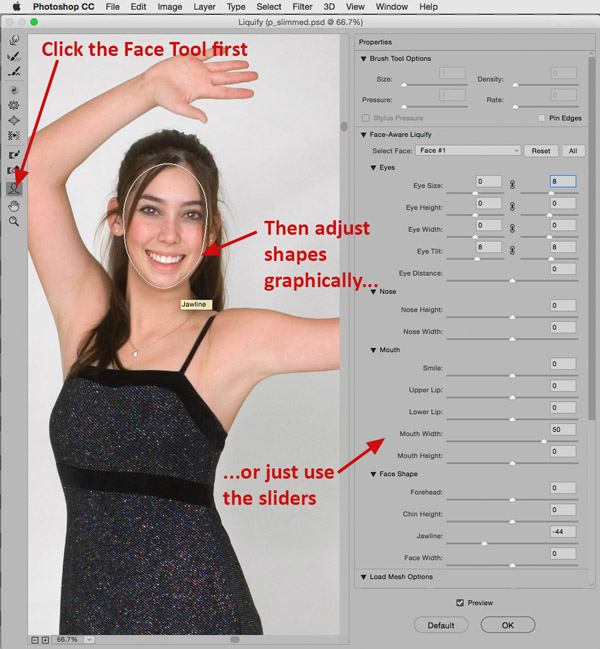
Slimming faces and figures with the Liquify filter
Use Filter>Liquify to bring up a dialog box for reshaping parts of your
pictures. It's ideal for slimming a waistline or a face. Examine the file called
p_slimmed,psd in Exercises 6 and switch between layers to see how the filter can
take off a few pounds.
To use the filter, select Filter>Liquify. In the dialog box, click the Advanced Mode button in the right column to show more options. Choose the Pucker tool (4th down) or the Bloat tool (5th down) to change shape. Change the brush size to suit the size of the area you wish to change, and reduce Brush Rate (try ~20 to start with) to slow the pace of adjustments. You may experiment with stronger settings if this proves to be insufficient. Be very careful of distorting geometric objects that may be included with the person - for example, someone holding a straight violin bow may present a challenge if the bow is positioned near the area to be retouched.
To use the Pucker tool, position it inside the area to be "slimmed", and drag it along the edge of the person still inside a little ways. If the change is too rapid, just click and drag the mouse inward in small increments along the edge.
My favorite way to use Liquify to slim faces and figures is with the Bloat tool (5th down) and start outside the person and push inward.
The Push Left tool moves pixels to the left when you drag the tool straight up.. The pixels will move to the right if you drag down. If you want to decrease the size of an object, drag the Push Left tool counterclockwise around it. Dragging the Push Left tool clockwise around an object will increase its size.
Photoshop's Help menu further describes these tools and the others found in the Liquify filter dialog. Masking can be done to prevent some parts of the picture from being changed by accident.
New in the CC2017 version is the Face-Aware Liquify feature that allows quick adjustment of items including eye size, eye distance, face width, and much more. Use the face tool to graphically move adjustment points or choose the numerical face adjustment sliders. If you have more than one face in the photo, be sure to select the desired one before adjusting. They are identified above the controls in the Face-Aware Liquify section of the dialog box.
Content Aware Fill
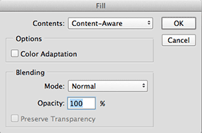
Photoshop CS5 added a new, powerful retouching tool called Content Aware Fill
(Edit>Fill, choose Content Aware for Contents). The Fill command used to be used
to merely fill a selected shape (or whole picture) with a single color or
pattern, but now it's become more intelligent for use with photos.
Open dort_stumChump_8256.dng from Exercises 1 (it's a camera RAW file, so it should open in Adobe Camera Raw for toning adjustments). The colors are fairly good, so just click the Open Image button near the bottom right.
Let's remove the sign on the stone wall that says "Sanctuary". Use the rectangular marquee tool to select the sign plus a little of the background stone around it.
Edit>Fill, and choose Content Aware for the Contents of the fill. The command should do a remarkable job of retouching the sign out of the picture.
If the fill isn't exactly what you want, just undo and try again. Photoshop randomly creates the fill based on the surrounding area, so each time you run it, it will look different.
If color blending isn't as expected, click the Color Adaptation check box to see if that helps.
More advanced retouching tips will be given toward the end of the quarter in case you are interested and wish to skip ahead.
A recommended book about various retouching techniques is Photoshop Restoration and Retouching by Katrin Eismann & Wayne Palmer (New Riders Publishing).
Another good book about photo restoration (and all good retouchers cut their teeth on challenging restoration projects) is Digital Restoration from Start to Finish, Second Edition: How to repair old and damaged photographs by Ctein.
Here's s spoof of Photoshop's wide-spread usage for retouching people in
advertising...
http://www.youtube.com/watch?v=cmyxmvJBjRk
Here's a web site that shows a 1-minute Flash movie of the glamour industry
and retouching.
http://www.youtube.com/watch?v=iYhCn0jf46U
(If the link breaks, search for Dove's Campaign for Real Beauty)
Photojournalists are greatly discouraged from retouching their images because it represents a departure from the truth. Here's a web site that shows a history of notable retouching in the media... http://www.cs.dartmouth.edu/farid/research/digitaltampering/
Type effects using skewed shadows and gradient fills
Work with type to demonstrate making a drop shadow, skewing it, making it fade from
dark to white using the gradient fill tool set to Foreground to Transparent.
First, demonstrate on musicians.tif how the Gradient fill tool normally fills the entire
area, then show how it fills just part of a photo when Gradient Fill Options are set to
Transparent to Foreground, or Foreground to Transparent.
STEPS FOR EXERCISE:
Make a new file at 7x5x72dpi., RGB color.
Choose a deep, bright red for foreground color.
Select the Text tool.
Create some type using a type face with wide strokes (Gil Sans Condensed Bold? Poster Bodoni? Franklin Gothic Condensed?) The word or phrase should be short - like the word "FESTA!", in all-caps. Try 100 pixel sized letters.
Duplicate the layer.
The illustration should now be a white background layer, with the middle layer and top layer containing identical type.
Select the middle layer and choose Layer>Rasterize>Type. This turns editable type into a pixels - unfortunately it's no longer editable after you rasterize it.
Check the Preserve Transparency box for the middle layer.
Edit>Fill, using black.
Uncheck the Preserve Transparency button in the Layers palette for following Gaussian blur step.
Gaussian Blur the middle layer about 3- 4 pixels.
At this point, offset it a bit from the top layer using the Move Tool to see the drop shadow immediately below the type. Change Opacity in the Layers Palette to make the shadow darkness realistic.
Experiment with Edit>Transform>Distort on the middle (shadow) layer to make it appear as if it were cast on a ground plane.
To add more realism to the cast shadow, make it lighter as it recedes from the original letterforms...
Select Preserve Transparency again for the middle (shadow) layer.
Set Gradient fill tool options to Foreground to Transparent in the Options bar. It's the second gradient thumbnail in the gradient drop down list.
Choose white as foreground color.
Fill the top part of the letters with the gradient tool with the white to transparent fill.
This creates a drop off of intensity of the shadow as in real life.
At this time, it might be worth experimenting with the gradient fill tool using the Spectrum Fill, Transparent Rainbow fill and other gradient options. For example, create a rectangle underneath the type and fill it with a Spectrum gradient. The effects are somewhat gaudy, but it demonstrates how to deploy a rainbow fill.
Created custom gradient fills in the Gradient Editor by clicking once on the gradient's
preview in the Options bar. Adding points to the top part of the gradient preview affects
transparency, while points added to the bottom of the preview adds additional colors to
the gradient.
Colorizing line-art using layers
This is a very common use of Photoshop. You can start with sketches,
scan them in, and finish the art in Photoshop. Sometimes designers may take
black and white line art and add color to heighten the visuals.
Let's do a tutorial on an advanced way to colorize line_art...
Open Cans.tif in Exercises 3.
Change to grayscale, then to RGB Color. (Image>Mode>Grayscale, then Image>Mode>RGB Color).
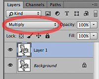
Choose Layer>New>Layer via Copy (or press Command-J) to make a new layer containing a copy of the background layer.
Change the mode of this copied layer to Multiply in the Layers palette drop-down list.
(NOTE: Using Multiply mode on an upper layer will make its white pixels disappear, and only the black pixels will be left visible. It's a great way to have the words from a scan of a handwritten note appear over a sunset sky, etc. It's also a great way to eliminate lighter pixel "fringe" from the edges of dark lines caused by anti-aliased being turned on. Professionals use this instead of selecting just the black pixels and copying them to the new layer because it works better.)
Make Background layer the active layer (click its name in the Layers Palette)
Completely fill the Background layer with white (Edit>Fill, using white for contents), or perhaps a gradient fill if you wish some background color.
Paint on the Background layer to colorize the illustration. To save time, apply color to larger areas first, then work your way into the smaller details. For example, you may wish to use a gradient fill to rapidly produce a background color before you start colorizing the small parts of the picture.
If you use a selection tool or the paint bucket tool to paint between layers, turn off anti-aliased for these tools. You're essentially working with line art, and anti-aliased will do strange things at the selection edges on line-art.
If desired, dodge and burn to make realistic gradations using the dodge and burn tools.
Optional: See what happens if you Gaussian Blur the painted bottom layer, or try some of the filters on the bottom layer to achieve other "looks". You might also try using the Paint Brush tool with the option bar mode set to Dissolve instead of Normal mode. You may even lasso parts of the colored area underneath and apply filters in selected areas. All of these actions leave the original drawing intact.
Further Research:
For a look at examples of colorized line art in the comic book industry , go Hi-Fi Design's web site -- http://www.hifidesign.com.
In reality, colorizing is more technical in
scope than the simple steps outlined above, and industrial-strength colorizing
addresses production issues such as trapping, etc.
| Technical Exercises 6: | Turn-In_06 folder - March 17 by midnight |
|
a) Colorize sunflower.tif (Exercises 3) to suit your personal preferences
color-wise. HINT: You may resample the file to 150 dpi to reduce
its size. The original is 300 dpi, and that becomes a fairly large file when converted to
24-bit RGB color. For this exercise, keep the original artwork intact. Don't delete or overpaint the original black lines. Also, submit this file as a PSD file and keep your layers intact. Do not flatten. |
|
| Creative Assignment 2: | Place files in the Collaboration > Creative-2 folder |
Due Dates:
|
| Checklist of Specifications for the Assignment: | |
| Number of pictures: | 1 picture |
| Picture size: | 5x7 inch minimum |
| Resolution: | 200 pixels per inch minimum |
| Color space: | Adobe RGB (1998) for RGB pictures, or grayscale Dot Gain 20% |
| Text OK?: | NO, unless it's part of a scan you are using (book page, etc.) |
| Content: | One-word assignment. See choices below |
| Identification: | Put YOUR LAST NAME as the first word of the filename. |
| File format: | JPEG, quality 7 or higher |
| Print Required? | Yes |
| Print specs: | Portfolio-quality print on 8-1/2 x 11 inch (letter-sized) paper |
| Assets Folder: | Required - see note below chart. |
| Clip art OK? | Don't use. All content should be your own. |
| Destination: | Creative-2 folder |
Notes: All digitized content (scans, digital photos, etc.) used in the making of your creative assignment must be submitted in a separate "assets" folder named "lastname_assets" (substituting your own name, of course.) If you create some graphic components in Illustrator or other program, please include all of those files. If you create the illustration completely in software, include some partially-completed steps in the assets folder. This folder is due on the day that the assignment is due. Please don't place your completed assignment into the assets folder though.
If the assignments don't meet the specifications given above, they won't be considered for a grade. That means if a file is submitted in sRGB instead of AdobeRGB, it gets a failing grade. Not having a quality print, not having an assets folder with all contents, or not meeting the minimum picture size or resolution also results in a zero for the assignment. Please pay attention to the assignment specifications!
Some tips for a better grade...
Illustrate one of the following concepts symbolically:
Cautiousness
Health
Greed
Smart
Friendship
Ambitiousness
Determination
Depression
Education
Pain
Inquisitiveness
You have more creative freedom with this assignment -- use your own interpretation of one of the listed choices. Remember that pictures that address the concept itself are more powerful than an isolated example of the concept. For example, a photographic portrait of a child is about that one specific individual. However a silhouette of happy children playing is about childhood, not a specific individual. A broad approach is preferred. Tip: show your preliminary illustrations to someone who does not know that assignment, and ask what they think the picture is about.
Both color and b/w images are acceptable, but text typed in Photoshop is NOT ACCEPTABLE! (The answer is NO - don't even try to ask!) Size is to be at least 5x7 inches at 200 dpi minimum. Remember to pay attention to copyright restrictions.
If you use images of currency, go to either the U.S. Secret Service web site at http://www.treas.gov/usss (it's a slow site!) to search the Know Your Money section for restrictions on illustrations, or go to my summary web page Restrictions on the Reproduction of Currency. For on-screen presentations, most of the regulations won't matter but know the law before you attempt to print images of currency in an illustration!
Note: Adobe Photoshop CS includes anti-counterfeiting software that prevents you from using scanned or photographed images of currency.
Submit the file in JPEG format (Quality 7 or higher) to save server space, but be sure to also save the original layered file for your own future needs. The file must also be submitted in the AdobeRGB (1998) color working space (Meeting 16 & Meeting 17 will cover how to do that).
Files that are too small or don't meet the color working space requirement will be given a failing grade.
Submit creative assignment file and the folder of digitized content to the Creative_02 folder. Also submit a portfolio quality 8-1/2 x 11 inch Epson print of the assignment. Follow the printing instructions presented earlier on this page for best results. Note that uptown printing businesses offer color prints, but I seldom find them satisfactory. The quality of the print (color, resolution, photo-quality, etc.) will be evaluated as part of the score for this assignment. Due at the beginning of class.
Files must be on the server by the deadline to allow time for student reviewers to assess the work. These will be critiqued in class in the critique day. Files not on the server by the deadline will receive a zero with no possibility of a remake.
Tips for a better grade on creative assignments...
| Class Prep Assignment 4: | Completed assessment due at the start of class on Crit day for your artist |
| 1) Each artist will have two student critics. Use either the PDF Crit
Form found here to aid assessment of the creative work, or use the Microsoft
Word version of the Crit Form available
here in case you wish to type your remarks. Bring the completed Crit
Forms to class on the day they are due. I will email a link to you that
shows a list of students whose work you will review. Note that this critique form is DIFFERENT from the first one. Be sure to download the new form linked here for this assignment. |
|