Meeting 21
Il mattino ha l'oro in bocca
Stump the Chump!
| Exercise Folder |
Filename |
| #5 |
model.jpg |
| #5 |
clouds.jpg |
Topics:
1. Using channels or the Refine Mask technique to mask intricate objects.
2. Using noise to create a unique mezzotint pattern.
3. Making "Distressed Type"
Creating Masks for Intricate Objects
If you ever have to create a transparency mask for an intricate object (to
put a person with wispy hair against a different background, for example), you
can use channels and a couple of tricks, or use Photoshop's Refine Mask dialog
to speed your work.
The following exercises use model.jpg and clouds.jpg (Exercises 5). We will
change the boring sky in the photo to something more dramatic.
See before and after examples here. A significant challenge is to place fine
detail like the hair blowing in the wind against a new background without
obtaining an artificial "cut-out" appearance.
First, try to select the sky behind the model with the magic wand tool to see
what effects you can achieve:
Open model.jpg.
Double click on the "Background" layer and call it "Model". Renaming
the background layer allows you to put another layer behind it in later steps.
Open clouds.jpg, select all and copy.
Add a new layer in the model.jpg picture and paste the new sky into it.
Rearrange the two layers to place the cloud layer beneath the Model layer
in the Layers Palette.
Make the Model layer active. (Click on its name in the layers palette).
Choose the Magic wand tool and click on the boring sky in the Model layer.
Layer>Layer Mask>Hide Selection.
Note how the model's hair and the grass look badly cut out because of the fringe
pixels that surround them. This method is unsatisfactory for faint areas that
partially blend into the background..
Layer>Layer Mask>Delete, and discard it to revert to a two-layer picture with
model on top, new sky on the bottom.
An improved way to create the transparency mask using Channels:
Click the Eyedropper tool in the Toolbox.
Choose a sample size of 3x3 or 5x5 pixels in the Eyedropper Options bar at the top.
With the Eyedropper tool, click on the sky color behind the model to make it
the foreground color. (Note: if the hair is light-colored against a dark
background, choose the light hair. Always choose the lighter of the two things.)
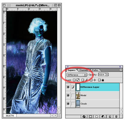
Add a new layer. (Click on the upper-right arrow in the Layers Palette,
choose New Layer...). Name the new layer "Difference Layer" in the dialog box.
Fill the new layer with the foreground color.
In the Layers palette, choose Difference as the way this layer interacts with
the photo below. It should appear like a negative (see below). Where the sky and
the background color are alike, black is seen and provides a fairly
high-contrast edge between hair and sky.
Now add a Levels Adjustment Layer above the other two layers to further
increase the contrast between hair and background sky. Slide the white point
triangle to the left about 20% and the black point triangle a little bit to the
right. Don’t overdo it.
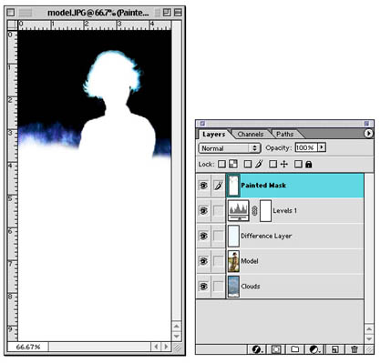
Add another new layer on top of the existing layers. Call it Painted Mask.
Make white the foreground color. (Type D, then X to set default colors and
then to interchange them with white on top.)
On the new Painted Mask layer, paint white on areas of the illustration that
obviously aren’t going to be transparent to any new background. Use the
rectangular marquee tool to quickly select and fill the bottom half of the
picture with white.
With the painting tools, color the inside of the model white. Where white
exists, no transparency will be applied. Where there is black, the image will
become transparent to the new background. The hair and the top of the distant
grass should retain a little tone so that they will merge with the new
background in a realistic way.
Lasso the interior of the face and fill it with white. Do the same for parts
of the dress that have tone in them. Feather the painting toward the indistinct
areas that are to be partly transparent. The indistinct areas themselves should
retain the tone you begain with. Don't paint over them. See the example below.
The white parts of the image are now protected from change, and the areas
with a partial tone will be somewhat transparent to the background to aid
blending of the two picture layers.
TIP: You can quickly fill using Shift-Delete (Shift-Backspace on a PC) to
bring up the fill dialog box. Be sure that the fill color is set to foreground
color or white.
TIP2: You can quickly fill something with the current foreground color by
pressing Option-Delete, and you can quickly fill with the background color by
pressing Command-Delete.
After you have painted out parts that are to remain visible, click on the
Channels tab. Drag the RGB channel to the Make Selection from Channel icon on
the bottom of the Channels palette.
Click on Save Channel as Selection icon on the bottom of the Channels palette
just in case you need the selection again.
Return to the Layers tab. Hide the top production layers from view (Levels
adjustment layer, Difference Layer, Painted Mask layer).
Click on the Model layer to make it the active layer.
Inverse the Selection if necessary to select the sky.
Layer> Layer Mask> Hide Selection.
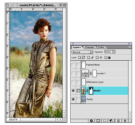
You should then see the new sky with the dramatic clouds.
Click on the background layer and use the move tool to slide it around for a
pleasing composition.
You may touch up any obvious mistakes using the painting tools on the
Transparency Mask.
Once you are satisfied, you may delete the hidden production layers (Painted
Mask, Levels adjustment layer, and Difference Layer) from the file.
Using Photoshop's Refine: Select and Mask technique
In early versions of
Photoshop, there was an Extract Filter to allow the selection of partially
blended areas of a picture, i.e. wispy hair. A tool that worked like a
highlighter was used to color over the area to be blended. Once the troublesome
area was highlighted, the rest of the picture would be deleted away, and
Photoshop would decide what was subject and what was background in the
highlighted area. It worked fairly well, but best of all, it was simple to use.
In Photoshop CS5, Adobe removed the Extract filter from the toolset, and replaces it with
a somewhat more complicated, but more powerful method. The new tool remained the
same until Creative Cloud 2017 where the interface and steps changed. The
instructions below are for Creative Cloud 2017.
Begin by superimposing the two layers (model on top, clouds on bottom), and
select the boring white sky on the top layer you wish to hide using the Quick Selection tool. Then
create a Layer Mask (Layer>Layer Mask...) to hide the selected area (the sky, in
our example).
The edges will be roughly trimmed and look bad. To improve the edges,
double-click the Layer Mask thumbnail to open
the Properties palette. Alternatively, choose Window>Properties to display it.
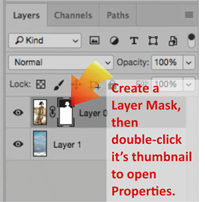
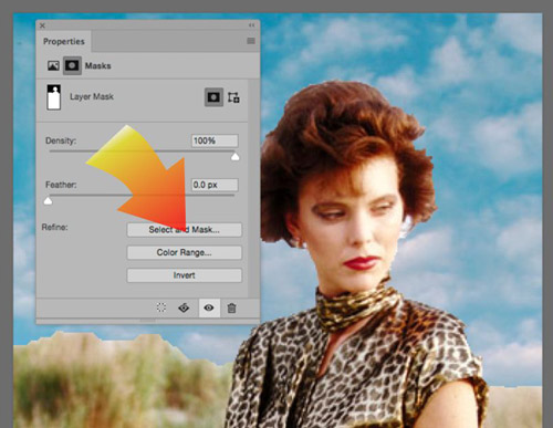
Clicking on the "Select and Mask" button will pop up a new interface for
refining the mask to make the edges more realistic. This is particularly true of
wispy hair or out-of-focus areas.
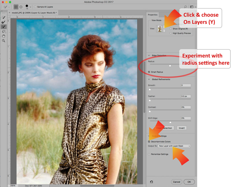
In the View Mode section of the dialog box, click on the picture
thumbnail and choose On Layers (L) so you can see a preview of your
composite picture.
For this picture, merely clicking on the Smart Radius button and sliding the
radius to around 25-30 will instantly improve the picture..
For this picture, a further improvement can be attained by checking the
Decontaminate Colors button.
There are assorted selection brushes on the left side of the dialog that
may help with refining the edges, but there is also much that can be done on
the resulting Layer Mask after clicking OK in this dialog.
There are other approaches for using the same masking dialog. In CC 2017,
there is a Select and Mask option in the Select menu that also opens the
dialog. Once opened, you can do all the selecting you wish and then refine
the mask edge using the controls in the right column. Adobe has a tutorial
video showing this approach here...
https://helpx.adobe.com/photoshop/how-to/selection-masking-space.html?playlist=/ccx/v1/collection/product/photoshop/segment/photographer/explevel/advanced/applaunch/orientation/collection.ccx.js&promoid=49F59RX3
Note that VisCom alum Tim Tadder contributed to this video.
Using Noise to create random patterns.
Create screen-resolution Grayscale document at 5x7.
Fill with medium gray. (Edit>Fill, choose 50% gray)
Add noise - (Filter>Noise) judge amount on preview.
Gaussian blur - (Filter>Blur>Gaussian Blur)
Threshold - (Image>Adjust>Threshold)
A pattern similar to that found on composition book covers is the
result.
Curious Variations:
Try Filter>Stylize>Emboss and then
Image>Adjustments>Threshold a second time.
Go further with a Gaussian blur again, followed by
Image>Adjustments>Threshold.
Undo Threshold.
Try Filter>Stylize>Find Edges with the pattern.
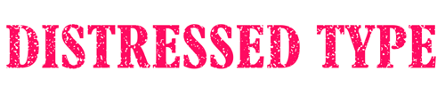
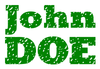
Using Random Patterns to Make Distressed Type
Here is an example of some distressed type
in a real-world advertisement:

A magazine wants type with random voids and roughness for a headline to be 7"
wide. Also assume the magazine specifies that all graphics containing type are to be 600
dpi.
Multiplying the print width by the resolution (7 inches x 600
pixels per inch) gives us 4200
pixels wide.
Assume it's just one line of type, so the height is relatively small. (It's a good thing -
a 4200 x 4200 pixel picture is 50 megabytes!). Let's estimate the height to be only
2
inches, so the height in pixels is 2" x 600 pixels/inch which gives 1200 pixels high.
File>New and type in 4200 pixels wide by 1200 pixels high. Choose RGB as the Mode
for now (will be converted to CMYK before printing), and
600 dpi as the resolution (as requested by the magazine).
Choose a rubber-stamp red as a foreground color.
Using the Type tool, type the words "DISTRESSED TYPE" in all caps. Use the Move
tool to reposition the type on the page. Select a suitable typeface and resize it to fill
the available space.
Make a new layer by clicking on the New Layer icon (upturned page) at the bottom of the
Layers palette.
Edit>Fill using 50% gray as the contents.
Filter>Noise>Add noise using 6%, Uniform, Monochromatic as the settings.
Filter>Blur>Gaussian Blur. Use a setting of about 3.5 to 6 for the blur radius.
Choose Lighten in the Layer's palette drop-down list of layer blending modes.
Image>Adjustments>Threshold. Adjust the slider for the effect you desire.
Crop out any unnecessary white space to ease the page designer's job.
Flatten the image, and save it as a TIF format file for printing, or GIF
or PNG format for the web.
Saving for text for the web (not print), save type (and other simple graphics that have few colors)
as a GIF or PNG file. Below are two examples - one saved as a JPG file that
shows visible compression artifacts, and the others saved as a GIF and PNG file.
PNG should equal the GIF file in quality, but the file size may be different.
Experiment.
 |
Saved as a JPG format file, quality
2. File size is 24k (a bigger file), and shows visible compression
artifacts. |
 |
Saved as a GIF file, 128 colors.
File size is 15k (a smaller file), and it looks sharper than JPG. |
 |
Saved as a PNG-8 file, 128 colors. File
size is 13.6k (a very small file), and it looks sharper than JPG. |
Saving simple graphics for the web as GIF or PNG files.
As you can see from the example above, some graphics look best on a web page when saved as
a GIF file (pictured) or as a PNG file. If you have only a few colors in your graphic, experiment
with GIF or with PNG. While these work well for simple graphics, keep in mind that photographs will almost always look better when saved
as JPGs instead of GIF files.
Here's another example of a graphic that has only a few colors in it, and saves
well as a GIF or PNG file. In the comparison graphics shown below, look closely at
the white background next to the text for the most
obvious differences between JPG and GIF/PNG.
 |
|
 |
| Saved as a GIF file (36k) |
Saved as a JPG file, Quality=4, (45k) |
| |
|
 |
 |
| Saved as a PNG-8 file (24k -
smallest) |
Saved as a PNG-24 file (61k -
largest) |
Note that files saved in the PNG-8 format and GIF files are limited to only
256 colors. PNG-24 and JPG can save 16.7 million colors. If you have a simple
graphic with just a handful of colors, choose GIF or PNG-8 to save on file size.
Conclusion:
For the web: GIF and PNG files are best for
simple graphics and text, JPGs are best
for photographs.
For print, use AI, EPS or TIF for graphics, and TIF or JPG for photos.
Editing GIF files
If you reopen a GIF file in Photoshop, it will be (at most) a 256-color,
Indexed Color mode file. Some tools in Photoshop will not function with Indexed
color mode files, and those that do may produce some severe quality issues. This
limitation applies to simply resizing GIF files too.
If you need to either edit or resize a GIF file, first convert the file into
a regular RGB file (Image>Mode>RGB color). After conversion to RGB, then do the
editing or resizing, and resave as a GIF file using the File>Save for Web
dialog.
|
Technical Exercises
9: |
Turn-in #09
- Due by April 7 |
Use a random pattern to create your own
name in "distressed type". The width of the file should be between
500-1000 pixels. To avoid ugly JPG compression
artifacts, this file should be submitted
as a GIF file. Use the "File > Export> Save for Web (Legacy)" feature of Photoshop to
use advanced features when saving GIF files.
|
