>
Making Cyanotypes
Making a cyanotype
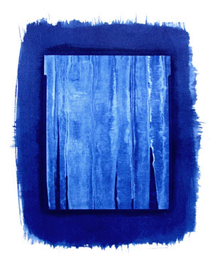 |
Cyanotypes are prints made using a hand-coated sensitizer.
They are blue in color instead of black, and are a popular alternative process
because of low cost and ease of use. Because the blue color is so striking, it's
often been an aesthetic challenge to match picture content to the strong blue
tint. |
The two chemicals required for making cyanotypes are Potassium Ferricyanide and
Ferric Ammonium Citrate (green). The green version of Ferric Ammonium Citrate is
the most light sensitive. The chemicals can be purchased from a
variety of sources including
Photographer's Formulary and
Bostick and Sullivan (100 gm. Ferric Ammonium Citrate is about $10, and 100
gm. Potassium Ferricyanide is about $7). Potassium Ferricyanide* is also an ingredient in Farmer's
Reducer.
The book
The Keepers of Light by William Crawford has instructions for making the
sensitizing solution from the two ingredients. While both chemicals can be mixed
together, most users mix them separately and then combine them just before a
printing session to extend life of the solutions.
|
Mixing Cyanotype Sensitizer |
|
Solution A |
|
Solution B |
| Water (room temp) |
100 ml |
Water (room temp) |
100 ml |
| Ferric Ammonium Citrate |
20 grams |
Potassium Ferricyanide |
8 grams |
You don't have to mix this much up if you don't plan to
use it all immediately. Note that just 1/4 the measures given above are
sufficient for one ambitious printing session.
Store these chemicals in dark brown tightly stoppered
bottles.
Under a yellow "bug light" safelight, mix equal amounts
(1:1) of
Solution A and Solution B into a shallow, non-metal dish or tray. Note that the
chemicals may stain whatever they are put into, and will stain clothing if
spilled.
Most users purchase watercolor paper for the prints.
Alkaline buffered art papers may not work as well because the cyanotype process
prefers slight acidity. You could experiment with alternative substrates like
cotton fabric if you feel adventurous.
In safelight, use a brush having no metal parts to coat
the paper. You can dry it with a hair dryer or let it dry overnight in a dark
location.
Place a negative in contact with the paper and insert the
"sandwich"
into a contact printing frame or between two sheets of plate glass. Tight
contact between negative and paper is important. If the negative lifts slightly
from the paper, you will have an unsharp area.
Expose to sunlight for about 15 minutes, or to a UV lamp.
UV lamps will take a little longer because they don't have the same UV content
as sunlight.
If you can keep the negative and paper in tight register, you can occasionally peek
to see the image appear. When properly exposed, it looks much darker than it
will after developing, and the shadows may appear reversed in tone. It takes a
bit of skill to properly judge.
To develop the image, immerse the exposed paper in running
water for 5 minutes. In the final change of wash water, add a dash of hydrogen
peroxide to deepen the blue color.
The Keepers of the Light book had several formulas for
toning cyanotypes. Here are the formulas for two different toning solutions:
Deep purple tones - bleach the print in a 5%
ammonia solution. Then wash the print, and tone it in gallic acid solution
mixed 1 gram to 100 ml water. Give the print a final wash afterwards.
Red-brown tones - immerse the print for 5
minutes in a tray of tannic acid solution mixed 6 grams/180 ml water.
Afterward, transfer it to another tray containing sodium carbonate solution
mixed 6 grams/ 180 ml water. Wash thoroughly and dry. The book mentions that
highlights may discolor to become slightly yellow after a while.
*Here's another handy use for Potassium Ferricyanide --
when used in
extremely dilute quantities as a presoak step before developing ordinary silver
prints, it reduces the contrast of the printing paper. That's useful if you are
using graded papers and a lower grade is not available. This
process used for both film and paper was the subject of an article titled Zone System Contraction - Selective Latent Image Manipulation by David
Kachel published in Darkroom & Creative Camera Techniques magazine Vol.
11, No. 5, Sept/Oct 1990 . It's a revision of the obscure "Sterry Method" of
contrast reduction.
William Schneider
Ohio University
2007
