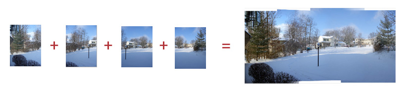
Another nifty trick is to use Tools>Photoshop>Photomerge to create a panorama from a series of individual pictures of a scene. In Exercises 8, there's a folder of pictures called panorama exercise to experiment with.
Meeting 5
Non e' mai troppo tardi
Topics: More about Layers, Working Further with Selections, Filters, Adobe Bridge
Textured Picture Mat
Make a textured top layer to vignette an underlying photo:
Open Musicians.tif (Exercises 1)
Duplicate layer by dragging the background layer to the New Layer icon in the Layers Palette.
Rename the top layer by double clicking on the layer's name. Call it "Overmat".
Default colors to black and white (Press the d key or click on the tiny default color icons in the Tool Box).
Filter> Render> Clouds
Filter> Stylize> Emboss -- adjust parameters to suite (makes the new layer textured like parchment or like leatherette.)
Try using the eraser tool to remove part of top layer. This will prove to be clumsy. TIP: If you don't see the size of the brush you are using to erase part of the image, change the brushes preferences (Photoshop>Preferences).
Edit>Undo
Use the elliptical marquee to select an area for deletion to show what's underneath and how hard it is to see where the "crop" is to be made. Press the keyboard's Delete key to remove the selected area and judge how accurately your selection was placed.
Edit>Undo
Now make the top layer about 60% opaque to see elliptical "crop" area underneath. The opacity can be changed by using the slider adjustment in the Layers palette. Crop by pressing the delete key. Notice the hard edges made by the selection.
undo again
Now feather selection area (Select>Modify>Feather and use about 15 pixels) Press the delete key on the keyboard to see soft edges.
Change Opacity in the Layers palette back to 100% for the Overmat layer.
Note: There are two places where feathering a selection can be done. The amount of feather can be set in both the Marquee Options bar (which applies the feather automatically each time you use the Marquee tool) and through the Select menu (Select>Modify>Feather) which modifies the selection after it has been made and is the choice that I most often use.
Crop the image tightly for appearance and to save file space, change the file to RGB mode (Image>Mode>RGB Color), and colorize the textured mat using Image>Adjustments>Levels. Change individual color channels in Levels to colorize the musicians layer. Generally, to make a sepia color (orangish), add red and reduce blue by moving the gray sliders in the Red and Blue channels. Click OK.
Try using the Edit>Fade command. It will fade or reduce the last adjustment for the picture. For example, if you didn't like the color you selected for the layer, the Edit>Fade adjustment will reduce the amount of color and move it back toward grayscale. This command works for reduce the effects of many different adjustments that you make to a picture.
TIP: To use the same adjustments on other layers or pictures, click the little dialog button in the Levels dialog box and Save the adjustment to your desktop. After you apply the adjustment by clicking OK, then click on the next layer, click the dialog button in Levels again, and Load the setting you just saved.
Another way to colorize a grayscale picture is to use Image>Adjustments>Hue/Saturation. Check Colorize in the dialog box, and move the Hue slider to get the color you want, and adjust the Saturation slider to determine how much of the hue you want. Adjustments made using Hue/Saturation can also be saved as a Preset file for reuse.
More About Selections
Open the file "ferrari wedding.jpg" (Exercises 4) for the following exercises:
Select>Color Range... opens a dialog box where you can select things based upon color much like the Magic Wand tool, but it has other options that make it more powerful. The Fuzziness slider works like the Tolerance control in the Magic Wand, but you can preview the selection in a window. You can add additional colors to the selection using the "+" eyedropper tool, and remove colors from the selection with the "-" eyedropper tool.
Use Select>Color Range to try selecting the red car.
After you select the car using Color Range, experiment a bit with Image>Adjustments>Hue/Saturation and slide the Hue slider back and forth.
Modifying Existing Selections
After a selection has been made with any selection tool (i.e., Magic Wand, Marquee tool,
Lasso tool, etc.), further changes can be made to the selection afterwards.
Some choices under the Select menu item include...
Select>Modify>Similar has already been discussed, but it's a way to select a similar colors throughout the entire picture.
Select>Grow expands a selection to include more colors or tones than what has been selected. For example, if you use the Magic Wand tool to click on a the red car, the Grow command will expand the selection to include somewhat similar colors. Each time the Grow command is used, additional nearby colors or shades of gray are selected.
Deselect when you are finished (Select>Deselect or type Command-d)
Select>Modify>Expand (or Contract) lets you add (or subtract) a given number of pixels around a selection. You specify the number of pixels to be added (or subtracted) to the selection in the dialog box that appears when you choose either of these options. To experiment with this, make an elliptical selection (using the Elliptical Marquee tool) above the man's head in the picture to give him a "halo" selection. Make the "halo" larger or smaller using the Modify>Expand or Modify>Contract items.
Select>Modify>Border changes a selection to an outline of the selection. You can control the number of pixels for the selection width in the dialog box. For example, a circular outline selection becomes a thin ring selection after using Border.
Drop shadows again
Exercise with selecting just one part of a scene and creating a drop shadow for the item
only. Used the clocks image and selected the low, rounded clock to place on two duplicate
layers. The middle layer, filled with black, becomes a shadow layer with 50% opacity so
that you can see through it to the rest of the detail in the picture.
Clock shadows step by step
Open clock image.
Select the low, rounded clock with the lasso tool. (Remember to use the shift and the option key to add or subtract from the selection.) In this exercise, it might be a good idea to select a little bit more than actually needed. The excess can be fixed later with careful edge erasing (or with Masking for which steps are given in a future lecture).
Layer>New>Layer Via Copy
Name the new layer "Shadow" (Double click on layer in the Layers palette to rename it)
Duplicate the layer that was just created to make a third layer. (Drag the layer to the New Layer icon in the Layers Palette, or choose Duplicate Layer in the layer pop-out menu). Rename the new layer "Top Clock".
Hide the Top Clock layer containing the clock by clicking on the eye icon on that layer in the Layers Palette.
Choose the middle layer (Shadow) and check the "Lock Transparent Pixels" icon. The icon for locking transparent pixels is the small checkerboard button in the Layers palette. Using it prevents the transparent pixels on this layer from being filled or otherwise changed.
Fill with black (Edit>Fill>choose Black for contents). Only the clock shape should be filled with black at this point, not the whole rectangle. Note that this fill is different from the shadow-gray we have used for shadows in the past - this will be fixed shortly. It's necessary for the shadow to look better when dropped over other objects in the picture.
Uncheck "Lock Transparent Pixels"
Gaussian blur (choose 7 or 8 pixels for this picture)
Change opacity of Shadow layer to 50%
Make the top layer visible and trim around the edges of the top clock if necessary for realism.
Select the Shadow layer in the Layers palette.
Choose the Move tool and move the Shadow layer into desired position.
Done.
Make a graphic key (exploring Photoshop's Threshold command)
Open key_ig.tif and scribbl.tif (Exercises 2).
The key picture was made by scanning it with a flatbed scanner. No photograph was involved. The scribble picture was pencil marks on rough paper and scanned using a flatbed scanner.
Make the scribble.tif picture into just black and white pixels. Use Photoshop's "Threshold" command for this simple, 2-color form of posterization (choose Image>Adjustments>Threshold).
Choose the Magic Wand tool (W).
UNCHECK anti-aliased in the Options bar at the top.
Select a white area of the scribbl.tif picture with the Magic Wand tool.
Select>Similar to also select the "islands" of white pixels within the picture.
Choose the Move tool (V), an drag the selected white area of scribbl.tif onto key_ig.tif window. IMPORTANT: Move the selected WHITE area. Click on white pixels before you start the move. Don't make the mistake of accidentally moving the selection marquee itself to the key picture.
Name the new layer. (double click the layer to rename it)
Select the Move tool.
Adjust the new layer's position until it looks good positioned against the key layer.
Hide the scribble layer (click it's eye icon off)
Choose the background layer that contains the key (Click on the layer's name in the Layers Palette).
Image>Adjustments>Threshold and slide the control to make the key picture just black and white - no shades of gray.
Undo if this is unsatisfactory and the key needs "tweaking" (and it does!).
Dodge and burn around the lettering to make it more prominent. You can use the Dodge and Burn tools in the tool palette to do this. (Optional - you can also dodge and burn using the lasso with a 3 pixel feather -- Select>Modify>Feather, 3 pixels).
Threshold again.
At this point, it probably looks OK, but needs work because some parts got
too dark, while other were too light. The following section explains "tweaks"
that will do a better job.
Perfecting the Graphic Key Illustration:
If further tweaking is desired to make the trademark more visible, etc, try the following
steps:
Select just the logo area with a rectangular selection area then run Image>Adjustments>Threshold on this area all by itself. You may need to undo a couple of times to dodge and burn. Remember that dodging and burning should be done while the picture still contains gray tones. Don't try to dodge and burn an already-thresholded part of a picture.
One you are satisfied with how the logo area looks, do a Select>Inverse.
Threshold again changing settings for the rest of the image for the best appearance. (Make it GRAPHIC, and BOLD!)
There may still be some gray areas remaining at the feathered selection borders, so Deselect (Command-D) then run Threshold again on the whole layer to change the remaining grays to b/w.
Turn on visibility of the scribble layer, flatten the image, change the
Image>Mode to Bitmap using any of the choices. Save as a TIF file.
Other Enhancements and/or Time Wasters:
Try adding gray airbrush strokes on part of the key and change to Bitmap using diffusion
dither (Image>Mode>Bitmap) and back to grayscale (Image>Mode>Grayscale) a few
times. Layers may have to be flattened to achieve this.
Using Photoshop's companion file browser named "Bridge"
Photoshop CS2 introduced a companion file browser named Bridge. In Photoshop
CS5, the Bridge icon
is located above the option bar to the left, and has a "Br" in the icon to identify it.
Next to it is Mini Bridge - essentially a file browser palette.
Because it is a separate program in the CS5 suite, it can also be launched by clicking on the program icon on the dock that has a "Br" in it.
In Bridge, picture thumbnails are larger than the usual Mac or Windows-generated icons for easier viewing -- and can be made even larger using the size slider at the bottom of the thumbnail window. Bridge allows you to sort using keywords, user-chosen ranking (assigned using keyboard shortcuts command-0 through command-5), copyright information, and a host of other things not usually considered sortable. With the user-chosen ranking feature, you can elect to show only pictures that have a rank of 4 or higher, for example.
Most professional level cameras produce proprietary files called "RAW Files". This is not an option on most consumer point-and-shoot cameras. Most pro photographers prefer to shoot RAW for quality, but the disadvantage is that the files are very large and require higher capacity memory cards for the cameras. Another disadvantage is that RAW files must be converted to a more readable format (TIF, JPG, etc.) before they can be used in page layout programs, sent via email, etc. However, the potential for a higher-quality pictures generally outweighs the disadvantages.
Bridge reads and adjusts camera RAW files to maximize quality. It is easier to tone a photo in Camera RAW than it is in Photoshop. Double click a camera RAW file in Bridge to open it in Adobe Camera RAW for toning.
TIP: You can set the Camera Raw Preferences in Bridge to open JPG files for toning in the Camera Raw interface if you prefer. On a Mac, choose Adobe Bridge CS5 (top left when the program is open)>Camera Raw Preferences. In the JPEG and TIFF Handling section, choose "Automatically open all supported JPEGs" in the JPEG list.
Copying "Develop Settings" from one file to others
One time-saving feature when toning a batch of photos is being able to copy the
toning corrections ("develop settings") from one picture to others. This is
useful if some or all of the photos need the same overall corrections.
Metadata addition and editing
You may batch edit the descriptions of multiple files, and quickly add common keywords
to internal file information by merely clicking a checkbox. Metadata (digital camera
exposure information, picture type, etc.) can be displayed for each file without
opening it.
Keywords
Keywords can be quickly added to your document's metadata with the click of a
check box. (Window>Keywords Panel). TO add keywords, click the dialog button icon at the
top left of the panel to add keywords or sub-keywords..
Batch Rename
Finally there is a batch renaming feature (Tools>Batch Rename...) useful for photographers whose digital
cameras automatically assign a numerical file name to each picture.
Batch Converting to Adobe DNG files for archiving and easy reading
Note: If you have an older
version of Bridge (i.e. CS2, CS3) and your new digital camera RAW format isn't
supported, try downloading the latest "Adobe DNG Converter" program to convert
the RAW files to Adobe's open-architecture DNG format. Then you should be able
to open the DNG files in your older copy of Bridge.
It might be wise to convert all your camera RAW files to DNG anyway because of two reasons: 1) It's an open architecture that has public specifications. It's not dependent upon the whims of the camera manufacturer with proprietary file formats, and 2) the tweaks you make to the tone of your picture are stored within the DNG file instead of being housed in a separate "sidecar" file. You file won't become separated from the toning metadata.
Image Processor
You can run some Photoshop commands within Bridge. One very useful tool in
Bridge is the Image Processor, found under Tools>Photoshop>Image Processor. For
example, it can be used to TIF files to JPGs. It can also automate the resizing
of one or many pictures for use on the web where you have a prescribed size
constraint (in pixels) for each picture. For example, if you have a need for
every picture to fit within a 200x300 pixel box, you can type in the height and
width limit in the Resize to Fit part of the dialog box, and all files will be
automatically opened and resized. In addition, you can tag each processed file
with copyright information, and even run a batch action (see Meeting 16) on the
files are they are processed. This might be useful for adding a black outline,
etc. to all the pictures.
PDF Slide Shows
I make PDF slide shows from a selection of photos in Bridge by clicking on the
Output button at the top right side of the screen, choosing PDF, and creating a
1 column x 1 row document at the pixel dimensions of the monitor or projector I
will be using. In VisCom room 306 for example, the monitor and projector can
display 1600x1200 pixels, so that's what I put into the Document field Width and
Height fields.
In the Playback area, I then check Open in Full Screen Mode.
Photomerge creates panoramas
Another nifty trick is to use Tools>Photoshop>Photomerge to create a panorama
from a series of individual pictures of a scene. In Exercises 8, there's a
folder of pictures called panorama exercise to experiment with.
For this particular exercise, the Reposition Only choice gives the most satisfactory panorama. The reason is because I held the camera fairly level for all four photos.
TIP: For best results, be sure there's some overlap in the scene edges in the separate pictures when you make them!
Other File browsing/database programs
I've recently become a big fan of Adobe Lightroom. It is a true database of your pictures
so it will display thumbnails much quicker than Bridge. Adobe is positioning
Bridge as a "jack of all trades" file browser that can show videos, etc, but at
the cost of speed. It's being targeted now mostly at print and web designers.
Lightroom is targeted to photographers. Like Bridge, Lightroom makes use of Adobe Camera Raw to tone photos.
In Lightroom's case, Camera Raw is built into the main interface of the program.
However, your workflow must be organized or Lightroom will be difficult to use.
One feature I really like is how a user can convert all imported files to Adobe DNG files on the way in. Saving files as DNG prevents the need for separate xmp sidecar files in addition to the native camera raw files.
Another feature I like is the ability to easily create a slideshow and incorporate music from mp3 files in Lightroom. As far as I know, this can't be done in Bridge.
Apple's Aperture is a similar and competing program, but it's only for Macs.
For a suggested workflow in Lightroom (written by Adobe employer and all-round nice guy Eric Scouten), go to http://blog.ericscouten.com/2009/09/lightroom-2-technique-how-i-organize-my-catalog-and-why-2009-edition/
| Technical Exercises 2: | Turn In_02 folder - Due April 20 |
| 1) Make a graphic key out of the file called Key.tif (the trunk key). Flatten the
layers in the image, then convert the file from grayscale to bitmap mode and lastly save
as a TIF file.
2) Make a drop shadow behind any rectangular photo like the exercise given in the previous class notes (Meeting 4 - overall drop shadows on rectangular pictures section). Flatten and save the picture as a JPG file. Be sure to add your last name to the files! Please submit files individually. Do NOT submit your files together in a folder that you make! The pictures below show how a correctly done key picture and drop shadow picture should look. Observe how they interact with the white web page background and how they affect your perception of three-dimensional space differently. |
|

*both pictures copyright William R Schneider - All Rights Reserved
![]()