Meeting 8
Nella botte piccola sta il vino buono
Topics: Printing Press Dot Limitations and Photoshop Output Levels,
Advanced Retouching, Content Aware Fill, Type,
Colorizing Line Art.
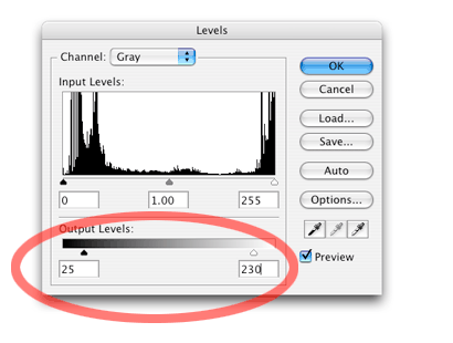
Printing press dot limitations
A printing press can't reproduce the extreme shadow or extreme highlight range of
a photograph well. In the brightest highlights, very small dots disappear leaving an
obvious "hole" in the reproduction. In the darkest shadows, large dots tend to
merge together, muddying any detail that may be present. Most pressmen prefer to have a
printing plate that does not have any solid black areas (100% dot) and does not have very
small dots in the highlights. After you tone a picture on screen to your satisfaction, you
may limit the dot percentage range in the Output Levels part of the Levels dialog box as
seen below. The chart shown below the diagram lists typical Photoshop Levels data to use
for this adjustment.
| Printing Stock | Dot Percentage Range | Photoshop Output Levels |
| Newsprint | 12-88 | 30-225 |
| Uncoated Stock | 10-90 | 25-230 |
| Coated Stock | 5-95 | 12-243 |
*Data from the book Real World Scanning and Halftones by David Blatner and Steve Roth, Peachpit Press.
TIP: To convert from printer's dot percent numbers to Photoshop levels, use this formula:
Photoshop level = 255 - (2.55 x percent)
As you might imagine, different paper stock reacts differently to dot limitations. Because newsprint is the most absorbent paper stock, dot gain and other printing problems are more pronounced when it is used. Coated papers have the least dot gain and can hold much smaller dots in the highlights without problems. The table above gives typical values for the dot percentages that various paper stock can hold. These percentages have been calculated. These values may vary depending upon halftone screen frequency, type of ink, and a host of other factors, so view this data as a starting point.
Note that at larger newspapers, this adjustment is usually done downstream in the production cycle by the pre-press department. The effects of this adjustment are cumulative! Don't adjust this value more than once, or the reproduction will deteriorate rapidly. The numbers given above are useful if you are working as a freelance designer, and you are the person responsible for production quality of the illustrations.
This adjustment compresses all tones to fit in the range specified, and does not limit the range by the method of "clipping" the highlight or shadow tones. The adjustment will shift all tones in the file, which you can determine through an on-screen experiment using a gray step scale (sometimes called a step wedge in the trade). Steps for the creation of a digital step wedge are detailed at https://www.afterness.com/digital/step_scale.html
The Healing Brush tool and the Patch tool
Open fade down.tif from Exercises 1.
Experiment with the Healing Brush tool and the Patch tool on this file.
The Healing Brush tool works much like the Clone Stamp (aka Rubber Stamp) tool where you option-click to set the source point and then move the cursor to the area to be retouched. It copies the texture, but keeps the tone of the area surrounding the cloned area. In this way, it doesn't make the retouching too light or dark compared to its surroundings.
The Patch tool works by using it to lasso an area that contains the flaws, then nudge the selected area to a different area that doesn't contain any defects. It copies the texture of the area it was moved to into the original area and does some tone matching. Be careful that you don't work too close to edges though. It gets confused.
Open Joe w dust.tif from Exercises 4 and try the same tools on this file to see if it works for a badly spotted picture.
Photoshop CS2 introduced a new version of the Healing Brush tool called the Spot Healing Brush tool. It doesn't require a Option-click before you start work. It works very well on dust spots.
To see some great examples of photo retouching in Photoshop, visit Greg's Digital
Portfolio web site at:
http://homepage.mac.com/gapodaca/digital/digital.html
Here's another site that shows before and after retouching. NOTE: This now
requires a login for potential clients. Nothing to see anymore...
http://www.fluideffect.com
Another retouching site...
http://glennferon.com/portfolio1
For an extreme example of Photoshop retouching, search YouTube for "Power of Photoshop". Warning - partial nudity!
To see some photo restoration that I've accomplished, see the Brix Photos folder in Exercises 1.
Slimming faces and figures with the Liquify filter
Use Filter>Liquify to bring up a dialog box for reshaping parts of your
pictures. It's ideal for slimming a waistline or a face. Examine the file called
p_slimmed,psd in Exercises 6 and switch between layers to see how the filter can
take off a few pounds.
To use the filter on one example, select Filter>Liquify. In the dialog box, choose the Pucker tool (4th down) Change the brush size to suit the size of the area you wish to change, and set Brush Density, Brush Pressure, and Brush Rate settings to 1 initially. You may experiment with stronger settings if this proves to be insufficient. Be very careful of distorting geometric objects that may be included with the person - for example, someone holding a straight violin bow may present a challenge if the bow is positioned near the area to be retouched.
To use the Pucker tool, position it inside the area to be "slimmed", and drag it along the edge of the person still inside a little ways. If the change is too rapid, try to just clicking the mouse in small increments along the edge.
Another way to employ Liquify to slim faces and figures is to use the Bloat tool (5th down) and start outside the person and push inward.
The Push Left tool moves pixels to the left when you drag the tool straight up.. The pixels will move to the right if you drag down. If you want to decrease the size of an object, drag the Push Left tool counterclockwise around it. Dragging the Push Left tool clockwise around an object will increase its size.
Photoshop's Help menu further describes these tools and others found in the Liquify filter.
Content Aware Fill
Photoshop CS5 adds a new, powerful retouching tool called Content Aware Fill
(Edit>Fill, choose Content Aware for Contents). The Fill command used to be used
to merely fill a selected shape (or whole picture) with a single color or
pattern, but now it's become more intelligent for use with photos.
Open dort_stumChump_8256.dng from Exercises 1 (it's a camera RAW file, so it should open in Adobe Camera Raw for toning adjustments). The colors are fairly good, so just click the Open Image button near the bottom right.
Let's remove the sign on the stone wall that says "Sanctuary". Use the rectangular marquee tool to select the sign plus a little of the background stone around it.
Edit>Fill, and choose Content Aware for the Contents of the fill. The command should do a remarkable job of retouching the sign out of the picture.
More advanced retouching tips will be given toward the end of the quarter in Meeting 18 in case you are interested and wish to skip ahead.
A recommended book about various retouching techniques is Photoshop Restoration and Retouching by Katrin Eismann & Wayne Palmer (New Riders Publishing).
Another good book about photo restoration (and all good retouchers cut their teeth on challenging restoration projects) is Digital Restoration from Start to Finish, Second Edition: How to repair old and damaged photographs by Ctein.
Here's a web site that shows a 1-minute Flash movie of the glamour industry
and retouching.
http://www.campaignforrealbeauty.com/home_films_evolution_v2.swf (link
looks to be broken, try this instead...
http://www.youtube.com/watch?v=iYhCn0jf46U
Photojournalists are greatly discouraged from retouching their images because it represents a departure from the truth. Here's a web site that shows a history of notable retouching in the media... http://www.cs.dartmouth.edu/farid/research/digitaltampering/
Type effects using skewed shadows and gradient fills
Work with type to demonstrate making a drop shadow, skewing it, making it fade from
dark to white using the gradient fill tool set to Foreground to Transparent.
First, demonstrate on musicians.tif how the Gradient fill tool normally fills the entire
area, then show how it fills just part of a photo when Gradient Fill Options are set to
Transparent to Foreground, or Foreground to Transparent.
STEPS FOR EXERCISE:
Make a new file at 7x5x72dpi., RGB color.
Choose a deep, bright red for foreground color.
Select the Text tool.
Create some type using a type face with wide strokes (Gil Sans Condensed Bold? Poster Bodoni? Franklin Gothic Condensed?) The word or phrase should be short - like the word "FESTA!", in all-caps. Try 100 pixel sized letters.
Duplicate the layer.
The illustration should now be a white background layer, with the middle layer and top layer containing identical type.
Select the middle layer and choose Layer>Rasterize>Type. This turns editable type into a pixels - unfortunately it's no longer editable after you rasterize it.
Check the Preserve Transparency box for the middle layer.
Edit>Fill, using black.
Uncheck the Preserve Transparency button in the Layers palette for following Gaussian blur step.
Gaussian Blur the middle layer about 3- 4 pixels.
At this point, offset it a bit from the top layer using the Move Tool to see the drop shadow immediately below the type. Change Opacity in the Layers Palette to make the shadow darkness realistic.
Experiment with Edit>Transform>Distort on the middle (shadow) layer to make it appear as if it were cast on a ground plane.
To add more realism to the cast shadow, make it lighter as it recedes from the original letterforms...
Select Preserve Transparency again for the middle (shadow) layer.
Set Gradient fill tool options to Foreground to Transparent in the Options bar. It's the second gradient thumbnail in the gradient drop down list.
Choose white as foreground color.
Fill the top part of the letters with the gradient tool with the white to transparent fill.
This creates a drop off of intensity of the shadow as in real life.
At this time, it might be worth experimenting with the gradient fill tool using the Spectrum Fill, Transparent Rainbow fill and other gradient options. For example, create a rectangle underneath the type and fill it with a Spectrum gradient. The effects are somewhat gaudy, but it demonstrates how to deploy a rainbow fill.
Created custom gradient fills in the Gradient Editor by clicking once on the gradient's
preview in the Options bar. Adding points to the top part of the gradient preview affects
transparency, while points added to the bottom of the preview adds additional colors to
the gradient.
Colorizing line art using layers
Open Book.tif in Exercises 3. (I might try a different file someday)
Change resolution to 200 dpi
Change to grayscale, then to RGB Color. (Image>Mode>Grayscale, then Image>Mode>RGB Color).
Choose Layer>New>Layer via Copy (or press Command-J) to make a new layer containing a copy of the background layer.
Change the mode of this layer to Multiply in the Layers palette drop-down list.
(NOTE: Multiply mode on an upper layer will make the white pixels disappear, and only the black pixels will be left visible. It's a great way to have the words from a scan of a handwritten note appear over sunset, etc.)
Make Background layer the active layer (click its name in the Layers Palette)
Completely fill background layer with white (Edit>Fill, using white for contents), or perhaps a gradient fill if you wish.
Paint on the background layer to colorize the illustration. To save time, apply large areas of color first, then work your way into the details. For example, you may wish to use a gradient fill to rapidly produce a background color before you start colorizing the small parts of the picture.
If you use a selection tool or the paint bucket tool to paint between layers, turn off anti-aliased for these tools. You're essentially working with line art, and anti-aliased will do strange things at the selection edges on line-art.
Dodge and burn to make realistic gradations using the dodge and burn tools.
Optional: See what happens if you Gaussian Blur the painted bottom layer, or try some of the filters on the bottom layer to achieve other "looks". You may even lasso parts of the picture and apply filters in selected areas .
Further Research:
For a look at how line art is colorized in the comic book industry (and download some
interesting Photoshop Actions), go to this page on Hi-Fi Design's web site -- http://www.hifidesign.com. It is more technical in
scope than the simple steps outlined above, and also addresses production issues such as
trapping, etc. By the way, this site has all sorts of other Photoshop steps to create
comic book illustrations such as pouring rain effects, etc.
NOTE: This web site has apparently changed. The steps were not found last time I looked.
Still, they have interesting information.
| Technical Exercises 4: | Turn-In_04 folder - Due May 4 |
| a) Colorize cans.tif (Exercises 3) to illustrate an imaginary article on an environmental
problem. Think how colors can elicit different feelings toward a subject and use those in
your color choices.
b) Colorize sunflower.tif (Exercises 3) to suit your personal preferences (i.e., however you want to do it.) HINT: You may want to resample the file to 150 dpi to reduce its size. The original is 300 dpi, and that becomes a very large file when converted to 24-bit RGB color. For these exercises, keep the original artwork intact. Don't delete or overpaint the original black lines. Also, submit these files as PSD files and keep your layers. Do not flatten. Do NOT submit your files together in a folder that you make! Please submit files individually.
|
|
![]()