Meeting 11
Chi di spada colpisce di spada perisce
Topics: Printer Technologies, Dot Gain on Printing Presses, Rasterizing EPS images,
Layer Masks, Auto Align.
Stump the Chump
Toning challenge picture of the day.
Printer technologies and capabilities
Refer to the printer summary chart (DESK_PRN.WB2) which is
distributed in class and is also available as an
Acrobat PDF file called VisCom Desktop Printers in my Handouts
section of the Digital Imaging web. In addition, see illustration of printer halftone
process -- also available in Handouts section.)
Various printers employ different underlying technologies to putting color on the page (dye sub, ink jet, laser). This is explained in class.
Also given explained are acceptable resolutions for the various printers for printing photos. Generally the picture resolutions that provide acceptable results are 170 dpi for the 600 dpi laser printers, and 200-300 dpi for Epson ink jet printers. There aren't many printers that can exploit resolutions higher than 300 dpi, although you may need the resolution "head room" if you plan to print larger than usual.
Print head maintenance (i.e. head cleaning and nozzle checks) is important for inkjet printers. They like to be used in order to keep nozzles clear.
If they have been sitting for a while, you will certainly find trouble with clogged nozzles that produce fine white lines in the print. To solve this, find and use the software utilities that are included in the printer driver software. To find the utilities for an Epson printer, start the Print Center utility in Mac OSX. Click on the Epson printer icon from the list, then click the Configure button near the top of the dialog box. This brings up a list of tools for the Epson such as the nozzle cleaning utility, print head check utility, and ink supply information.
If an inkjet printer has been sitting idle for a very long time, it might not be able to work without mechanical repair.
Archived Instructions for printing to the Epson 890 printers under Mac OSX 10.3 Panther.
Archived Instructions for printing to the Epson 890 printers under OS9.
Archived Instructions for printing to the Epson 1270 or 870 printers under OSX 10.2. Printing to the 890 printers is identical to the 870 printers except for the different profile chosen in the Photoshop Print with Preview dialog box.
Many inexpensive inkjet printers use dyes that have a short display life. If you can, use inkjet printers that employ long-lived pigments (i.e. Epson 2200, the lab's Epson 4800, etc.) instead of dyes to maximize print life. If you are interested in additional print longevity issues, go to the Wilhelm Research web site at http://www.wilhelm-research.com/
Online Printing Services
If you wish to have longer lasting prints than dye-based
printers can provide and can't afford a printer that employs pigments, try a service that offers Fuji Crystal Archive photographic paper
like Shutterfly at www.shutterfly.com or find
advanced inkjet printers that use pigment inks like
West Coast Imaging.
Online printing service Shutterfly has an easy to use online interface for uploading pictures and ordering prints from your picture files. It takes about a week to get prints delivered here in Ohio.
Shutterfly also has options for professional photographers who wish to set up professional galleries of work for sale over the web. For example, a wedding photographer could upload photographs and provide the wedding party with a link to a gallery made specifically for the event. The photographer sets prices for the work, chooses what print sizes are offered, and Shutterfly handles all the business transactions (credit card billing, mailing, etc.). Profits accrue to the photographer depending on how many pictures are sold and the pricing set by the photographer. There are various fees for Shutterfly's professional service depending upon how much online storage you need for your pictures.
While the majority of Shutterfly's business is photographic prints, they also offer picture mugs, puzzles, keepsake boxes, mouse pads and photo books. For a pro account holder, you can make these available to your customers.
Setting up a Shutterfly Pro Account:
First, set up a
normal consumer Shutterfly account - it costs nothing to do. Go to
www.shutterfly.com to do that.
After you have created a standard consumer account, then contact Jonathan Levers jlevers@shutterfly.com using your OU email account to request the Pro account options.
Among the advantages of using Shutterfly over using an Epson printer is that you never have to worry about clogged nozzles again!
Dot Gain
Dot gain is the tendency of halftone dots to grow in size when printed on a printing
press. This is due to the pressures applied to the paper when printed, and wicking of the
ink into the paper fibers. Coated papers, not being as porous as uncoated papers, have a
smaller dot gain than uncoated papers.
Dot gain also limits the size of the dots that can be applied to paper. Because newsprint wicks ink more readily than coated papers, tiny halftone dots would grow enough to fill the small white spaces between dots. This destroys image reproduction. As a result, screen frequencies (which determines the dot size) are lower for newsprint.
The following chart lists some typical dot gain percentages when printing (data from Real World Photoshop 3, Blatner & Fraser, Peachpit Press 1996):
| Printing Press and Paper Stock | Typical Dot Gain | |
| Web press, coated paper | 17-22% | |
| Sheetfed press, coated paper | 12-15% | |
| Sheetfed press, uncoated paper | 18-22% | |
| Newsprint | 30-35% | |
| Positive Plates | 10-12% | |
Description of the capabilities of Postscript printers (advantages and disadvantages) and cause of some postscript errors - nested EPS, excessive resolutions, wrong printer ppd file chosen in QuarkXPress, improper page setup (i.e. landscape sent to portrait page). Postscript printers have the capability to print EPS files, but describe what happens when EPS files can’t be found by a page layout application.
Rasterizing EPS or AI Graphics into Bitmaps for Printing to Non-PostScript
Printers
Freehand and Adobe Illustrator create vector art that, by nature, does not have resolution
associated with the picture. They always print at the resolution of the printer - meaning
that if you use a very high resolution imagesetter, you will benefit by having the image
rendered at thousands of dots per inch. Vector artwork is not comprised of a grid of
pixels, but rather a mathematical description of curves, fills, etc. that are independent
of resolution concerns.
Freehand and Illustrator users commonly export their files in the EPS (Encapsulated PostScript) format for use in page design programs like QuarkXPress, InDesign, or PageMaker. Unfortunately EPS files embedded in the documents for of these programs require a PostScript printer to satisfactorily render the graphic. If you are using an Epson printer (not PostScript capable), the image will likely print with the "jaggies" showing because it is printing just the low-res screen preview that is attached to the file.
There are several possible workarounds for printing documents that have embedded EPS or AI graphics to Epson printers. One method is to use the PostScript rasterizer that is built into Adobe Acrobat (rasterize= change from vector art to a picture made of pixels). The procedure is to print the file containing the EPS graphics to Acrobat Distiller (the PostScript interpreting engine part of Acrobat) and create an Acrobat file with the graphics rasterized. This requires several steps, and is fraught with possible errors like poor selections in Acrobat's preferences, etc.
Another way to permit EPS graphics to print well to non-PostScript printers is to use Photoshop to rasterize the vector artwork. After rasterization, the file can be saved as an ordinary TIF file for placement in the page design program. Photoshop permits any reasonable choice of resolutions to be chosen for the task.
Another hurdle is that often EPS files from vector art programs like Freehand is that they are in CMYK color format. If you opt to bring it in as an RGB or Grayscale file, it uses the inverse of the RGB>CMYK or Gray>CMYK conversion and the CMYK dot gain and/or undercolor removal settings cause the file not to have a true black where there should be one. The following steps show how to choose a proper resolution for the graphic and to overcome the tendency to open without having a true black.
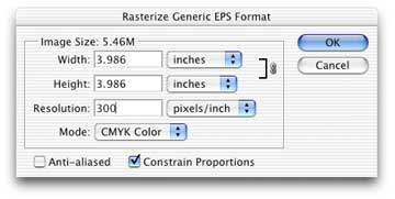
Open the file called deardrf2.eps in Exercises 6. You should get a dialog box that asks what size and resolution you wish to use to open the file as shown below.
Choose whatever size you need (one advantage of an EPS graphic is that you can resize it with no loss of resolution), and choose an appropriate resolution (for a b/w line-art graphic, it should be 600 pixels/inch, but remember the file size could be huge when it opens in CMYK format). If you have b/w line art, uncheck Anti-aliased. When printed, an anti-aliased line art graphic may appear to have a fuzzy edge which is undesirable.
When you click OK, the graphic will open in Photoshop, become comprised of pixels, and cease to be a vector graphic. That's called Rasterizing the file.
You will notice that the graphic will open possibly with transparent areas around it, indicating that the Layers palette doesn't have a true Background Layer. Flatten the image to view it normally. (In the Layers Palette, click the arrow on the upper right to display the drop down list of choices, and choose Flatten Image).
If you now convert the image to Grayscale or to RGB color (Image>Mode>Grayscale or RGB), it will not have a true black in it. This can be seen by moving the cursor around the black areas and looking at the Info palette. In order to keep the shades of black envisioned by the graphic's creator, you must discard the Cyan, Magenta, and Yellow channels in the Channels palette.
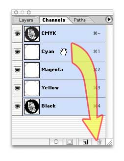
Discard channels by dragging them individually to the small trash can icon at the bottom of the Channels palette. Only the Black channel should remain.
Now convert to Grayscale (Image>Mode>Grayscale), then if desired, convert again to the bitmap mode. Because this particular graphic (Deardrf2.eps) contains grayscale information, it should remain a grayscale image and not be changed to bitmap mode.
Save the file as a TIF file for placement in Quark, Word, InDesign or other program, and it should now print easily to non-PostScript printers like an Epson.
Layer Masks
Introduce layer masks using the Grayscale Church.tif + Great taste.tif.
Reset all tools. (Click on the tool icon in the Options bar, choose Reset All Tools).
Open Grayscale Church.tif and Great Taste.tif.
Select all of the Great Taste.tif image (Command-A).
Click on the Move Tools (V)
Click in Great Taste.tif and drag the image onto the Grayscale Church window to create a new layer. Check to see if a new layer holding Great Taste.tif has indeed been created.
Layer>Add Layer Mask>Reveal All to create a layer mask that makes top layer opaque to underlying layer.
Choose black as the foreground color and select a painting tool (Airbrush, Paintbrush, Pencil).
Paint over areas with black to make them transparent. Paint over areas with white to make them opaque again. Gray gives partial opacity.
Paint over the top image (you're actually painting on its layer mask) to leave just the women and the church background.
Layer masks have an advantage over just erasing part of the image away because you can change your mind about any part of the image later on. Just paint white to make opaque, paint with black to make transparent.
CAUTIONARY NOTE: After you click away from a layer that has a layer mask and you want to return to adjust the layer mask, be sure to click on the layer mask icon in the layers palette. If you click on the picture thumbnail, you will be painting black or white or gray onto the original image, destroying it. You are not painting on the layer mask if you have a paintbrush icon showing in the layers palette!
Using Layer Masks to Blend the Best Parts of Studio Photos
Layer masks can be used to combine the best parts of two similar images.
It's always been challenging to do group photos where someone always blinks.
Worse, if you have young children to deal with, you may have only a frame or two
where they are looking "normal".
For an exercise showing this, go to Exercises 3 and open the two files named Studio1.jpg and Studio2.jpg.
Select>All of the Studio1.jpg picture, and Copy (Command-C)
Switch to the Studio2.jpg picture (click the appropriate tab at the top of the picture windows).
Paste it into Studio2.jpg (Command-V). The copied picture (Studio1.jpg) should become a new layer positioned above the bottom layer.
Notice the problem expression of the woman on the left side.
You first have to align the layers if the camera wasn't held stationary on a tripod. A new step introduced in Photoshop CS4 makes it easy to do. First, click on the background layer in the Layers palette, then shift-click on the top layer. This selects both layers in the palette, and they should both have a light blue highlight on the pair of layer names.
Edit>Auto Align Layers, and click the Auto button in Projection. This will stack the layers in alignment as much as possible.
In the Layers palette, click on the top layer alone. Only it should have blue highlighting for the following step.
After selecting the top layer, choose Layer>Layer Mask>Reveal All. This choice places a layer mask on the layer upon which you can paint to hide parts of the top layer.
Choose the paintbrush tool, make black your foreground color, and paint over the problem face. You are hiding the top layer in the painted areas, and letting the better expression from the bottom layer show through.
TIP: You can open multiple files from Bridge into Photoshop and have them automatically stack as layers if you wish. It saves the copying and pasting that is necessary otherwise. To do this, click on all the files you wish to stack as layers, and choose Tools>Photoshop>Load Files into Photoshop Layers.
Producing unusual effects using two similar images by blending between them using the Layer Mask.
Open the files called JUSTMAN.TIF and J_MANOUT.TIF in Exercises 3.
Select All of the J_MANOUT.TIF file, and drag it onto the other picture using the Move Tool.
Add a new Layer Mask to the top layer (Layer>Add Layer Mask>Reveal All)
Use the Gradient fill tool with Default colors (black and white) to drag across the picture. This creates a transition between visibility of the top layer and the bottom layer.
If it doesn't look right, drag another gradient and repeat until the picture is mostly acceptable.
Touch up any areas that need more or less transparency using the Airbrush tool set to a low Pressure setting in the Options Bar (use ~10% for gentle blending).
The resulting picture should look like a drawing that makes a transition to a more fully rendered image.
Faux HDR (High Dynamic Range) Blending
Commonly the scene brightness range of a photographic subject exceeds that which
can be captured in one exposure. The shadows are too dark to record well, and
brilliant highlights are blown out.
If you make several different exposures of this kind of scene (one to record shadows, another to record the midtones, and a third to hold highlight detail), you can blend these together with a Faux HDR technique.
Open FauxHDRAutoStack_Blend.psd from Exercises 6. Note the layer structure in this file contains both Before and After folders. (NOTE: The top layer group (named "After") should be hidden.)
Click on the bottom layer in the Before group in the Layers palette to highlight it, then shift click the third layer up (it's the top layer in the "Before" group). This highlights all the "Before" layers.
Choose Edit>Auto Blend Layers, and click "Stack Images", and check the box "Seamless Tones and Colors". In a few seconds, the layers will be blended together to hold more detail than any one layer does. It shows shadow information clearly, and there are few blown out areas.
If you want to tweak the result, layer masks have been created for each layer. You may paint on the layer masks to change certain areas of the picture.
| Tech Exercises 6: | Both exercises are due no later than May 11 - Turn-in_06 folder for the file |
|
a) Blend dollar bill images using a layer mask. Use BUCK$.JPG and BUCKLINE.TIF (Exercises 3). Resample size or resolution as needed. Gently blend together both halves of the illustration using a Layer Mask. Make the "forward" part photographic, with the "rear" portion appearing as line-art as shown in the thumbnail below. Please save the file as a Photoshop PSD with your layers intact, and place into the Turn-In_06 folder. b) Make a print of the file PDI Target small.tif (found in
Exercises 4) on the Epson 4800/Colorburst Rip printer. Follow the printing instructions
given at the beginning of this lecture. Please do NOT resize the picture in the
print dialog box using "Scale to Fit Media" (it cuts off part of the
picture!), and do NOT print this portrait orientation picture to landscape
paper. Prints can be delivered to the VisCom office if I am not personally available. You can even slip them under my door. Be sure your name is on the print. |
|
|
| © 1991 Wm Schneider All Rights Reserved |
| Checklist of Specifications for the Assignment: | |
| Number of pictures: | 1 picture |
| Picture size: | 5x7 inch minimum |
| Resolution: | 200 pixels per inch minimum |
| Color space: | Adobe RGB (1998) for RGB pictures, or grayscale Dot Gain 20% |
| Text OK?: | NO, unless it's part of a scan you are using (book page, etc.) |
| Content: | One-word assignment. See choices below |
| Identification: | Put YOUR LAST NAME as the first word of the filename. |
| File format: | JPEG, quality 7 or higher |
| Print Required? | Yes |
| Print specs: | Portfolio-quality print on 8-1/2 x 11 inch (letter-sized) paper |
| Assets Folder: | Required - see note below chart. |
| Destination: | Creative_02 folder |
Notes: All digitized content (scans, digital photos, etc.) used in the making of your creative assignment must be submitted in a separate "assets" folder named "lastname_assets" (substituting your own name, of course.) This folder is due on the day that the assignment is due. Please don't copy your completed assignment into the folder though.
If the assignments don't meet the specifications given above, they won't be considered for a grade. That means if a file is submitted in sRGB instead of AdobeRGB, it gets a failing grade. Not having a quality print, not having a content folder with all contents, or not meeting the minimum picture size or resolution also results in a zero for the assignment. Please pay attention to the assignment specifications!
Some tips for a better grade...
Illustrate one of the following concepts symbolically:
Cautiousness
Health
Winter
Fall
Spring
Growth
Inventiveness or Creativity
Friendship
Ambitiousness
Depression
Education
Exhilaration
Boldness
You have more creative freedom with this assignment -- use your own interpretation of one of the listed choices. Remember that pictures that address the concept itself are more powerful than an isolated example of the concept. For example, a photographic portrait of a child is about that one specific individual. However a silhouette of happy children playing is about childhood, not a specific individual. A broad approach is preferred. Tip: show your preliminary illustrations to someone who does not know that assignment, and ask what they think the picture is about.
Both color and b/w images are acceptable, but text typed in Photoshop is NOT ACCEPTABLE! (The answer is NO - don't even try to ask!) Size is to be at least 5x7 inches at 200 dpi minimum. Remember to pay attention to copyright restrictions.
If you use images of currency, go to either the U.S. Secret Service web site at http://www.treas.gov/usss (it's a slow site!) to search the Know Your Money section for restrictions on illustrations, or go to my summary web page Restrictions on the Reproduction of Currency. For on-screen presentations, most of the regulations won't matter but know the law before you attempt to print images of currency in an illustration!
Note: Adobe Photoshop CS includes anti-counterfeiting software that prevents you from using scanned or photographed images of currency.
Submit the file in JPEG format (Quality 7 or higher) to save server space, but be sure to also save the original layered file for your own future needs. The file must also be submitted in the AdobeRGB (1998) color working space (the next lecture, Meeting 12, will cover how to do that).
Files that are too small or don't meet the color working space requirement will be given a failing grade.
Submit creative assignment file and the folder of digitized content to the Creative_02 folder. Also submit a portfolio quality 8-1/2 x 11 inch Epson print of the assignment. Follow the printing instructions presented earlier on this page for best results. Note that uptown printing businesses offer color prints, but I seldom find them satisfactory. The quality of the print (color, resolution, photo-quality, etc.) will be evaluated as part of the score for this assignment. Due at the beginning of class.
Tips for a better grade on creative assignments...
Due Dates:
May 10 TTh Class
May 16 MW Class
![]()