Meeting 13
Topics:
1. Using channels or the Refine Mask technique to mask intricate objects.
2. Using noise to create a unique mezzotint pattern.
3. Making "Distressed Type"
4. Making computer-generated "Lightning".
5. Paths - Created by the Pen tool; creating clipping paths for cutout pictures
in printed material.
Sorry, no Stump the Chump today. Not enough time left in this lecture.
Creating Masks for Intricate Objects
If you ever have to create a transparency mask for an intricate object (to put a person with wispy hair against a different background, for example), you can use channels and a couple of other tricks to speed your work. If you need to do this kind of work routinely, invest in specialty software such as Ultimatte Knock-Out (http://www.ultimatte.com , phone 818-993-8007) or the Extensis Mask Pro 2.0 Photoshop plug-in (http://www.extensis.com, phone 503-274-2020). These Photoshop plug-ins will automate many of the steps that follow. Photoshop's own Extract command will automate much of this work, and will be addressed later in this exercise.
The following exercises use model.jpg and clouds.jpg (Exercises 5). We will change the boring sky in the photo to something more dramatic. See before and after examples here. A significant challenge is to place fine detail like the hair blowing in the wind against a new background without obtaining an artificial "cut-out" appearance.
First, try to select the sky behind the model with the magic wand tool to see what effects you can achieve:
Open model.jpg.
Double click on the "Background" layer and call it "Model". Renaming the background layer allows you to put another layer behind it in later steps.
Open clouds.jpg, select all and copy.
Add a new layer in the model.jpg picture and paste the new sky into it. Rearrange the two layers to place the cloud layer beneath the Model layer in the Layers Palette.
Make the Model layer active. (Click on its name in the layers palette).
Choose the Magic wand tool and click on the boring sky in the Model layer.
Layer>Add Layer Mask>Hide Selection.
Note how the model's hair and the grass look cut out because of the fringe pixels that surround them. This method is unsatisfactory for faint areas that blend into the background..
Layer>Remove Layer Mask, and discard it to revert to a two-layer picture with model on top, new sky on the bottom.
A better way to create the transparency mask:
Click the Eyedropper tool in the Toolbox.
Choose a sample size of 3x3 pixels in the Eyedropper Options bar at the top.
With the Eyedropper tool, click on the sky color behind the model to make it the foreground color. (Note: if the hair is light-colored against a dark background, choose the light hair. Always choose the lighter of the two things.)
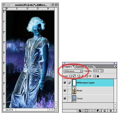
Add a new layer. (Click on the upper-right arrow in the Layers Palette, choose New Layer...). Name the new layer "Difference Layer" in the dialog box.
Fill the new layer with the foreground color.
In the Layers palette, choose Difference as the way this layer interacts with the photo below. It should appear like a negative (see below). Where the sky and the background color are alike, black is seen and provides a fairly high-contrast edge between hair and sky.
Now add a Levels Adjustment Layer above the other two layers to further increase the contrast between hair and background sky. Slide the white point triangle to the left about 20% and the black point triangle a little bit to the right. Don’t overdo it.
Add another new layer on top of the existing layers. Call it Painted Mask.
Make white the foreground color. (Type D, then X to set default colors and then to interchange them with white on top.)
On the new Painted Mask layer, paint white on areas of the illustration that obviously aren’t going to be transparent to any new background. Use the rectangular marquee tool to quickly select and fill the bottom half of the picture with white.
With the painting tools, color the inside of the model white. Where white exists, no transparency will be applied. Where there is black, the image will become transparent to the new background. The hair and the top of the distant grass should retain a little tone so that they will merge with the new background in a realistic way.
Lasso the interior of the face and fill it with white. Do the same for parts of the dress that have tone in them. Feather the painting toward the indistinct areas that are to be partly transparent. The indistinct areas themselves should retain the tone you begain with. Don't paint over them. See the example below.
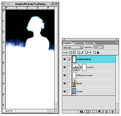
The white parts of the image are now protected from change, and the areas with a partial tone will be somewhat transparent to the background to aid blending of the two picture layers.
TIP: You can quickly fill using Shift-Delete (Shift-Backspace on a PC) to bring up the fill dialog box. Be sure that the fill color is set to foreground color or white.
TIP2: You can quickly fill something with the current foreground color by pressing Option-Delete, and you can quickly fill with the background color by pressing Command-Delete.
After you have painted out parts that are to remain visible, click on the Channels tab. Drag the RGB channel to the Make Selection from Channel icon on the bottom of the Channels palette.
Click on Save Channel as Selection icon on the bottom of the Channels palette just in case you need the selection again.
Return to the Layers tab. Hide the top production layers from view (Levels adjustment layer, Difference Layer, Painted Mask layer).
Click on the Model layer to make it the active layer.
Inverse the Selection if necessary to select the sky.
Layer, Add Layer Mask, Hide Selection.
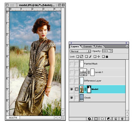
You should then see the new sky with the dramatic clouds.
Click on the background layer and use the move tool to slide it around for a pleasing composition.
You may touch up any obvious mistakes using the painting tools on the Transparency Mask.
Once you are satisfied, you may delete the hidden production layers (Painted Mask, Levels adjustment layer, and Difference Layer) from the file.
Using the Extract Command to Mask Intricate Objects (obsolete in CS5)
CS4 Note: The Extract filter is not installed automatically in Photoshop CS4. It is included on the installation CDs (check on the third disk), but you must install it yourself by copying the filter manually. Be sure to follow any instructions supplied by Adobe for installing filters in Photoshop.
CS5 Note: Adobe has removed the Extract filter from the program. The web notes for using the Extract Command have been deleted from this web site.
Using the Refine Mask technique
Photoshop CS5 removed the Extract filter from the toolset, and replaces it with
a somewhat more complicated, but more powerful method.
In short, the steps are to create the two layer composite, and select the area on the top layer you wish to hide using the Quick Selection tool. Then create a Layer Mask (Layer>Layer Mask) to hide the selected area (the sky, in our example).
The edges will be roughly trimmed and look bad. To improve the edges, choose the Masks palette (Window>Masks), then click on the Mask Edge... button in the palette.
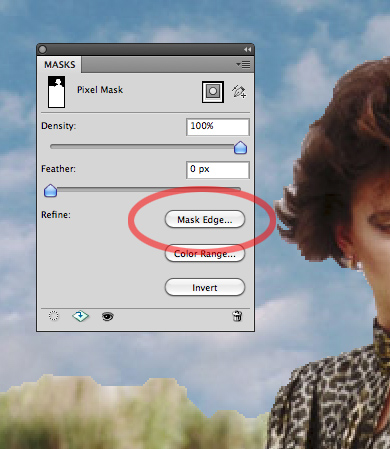
Clicking on the Mask Edge button will pop up the Refine Mask dialog box to allow improvements on the fly.
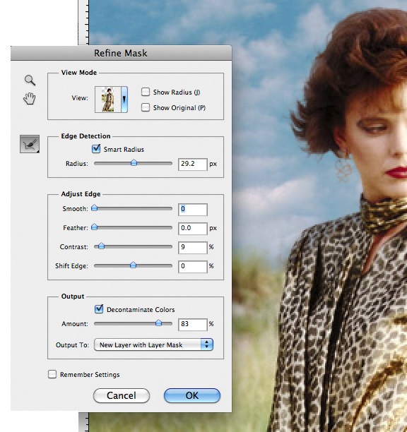
For this picture, merely clicking on the Smart Radius button and sliding the radius to around 25-30 will instantly improve the picture. However, there are further refinements possible. Click on the brush button on the left side of the Edge Detection section and trace around fuzzy, indistinct areas (hair, etc.) with a large brush, and use a smaller brush for hard edge areas like the model's shoulder and face. When you release the mouse button, you should see the results of this selection edge modification instantly.
For this picture, a further improvement can be attained by checking the Decontaminate Colors button, and sliding the Amount slider to the right.
For more info about features in the Refine Mask dialog box, see Russ Brown's video about CS5 masking at http://av.adobe.com/russellbrown/CS5MaskBasics_SM.mov
Using Noise to create random patterns.
Create screen-resolution Grayscale document at 5x7.
Fill with medium gray. (Edit>Fill, choose 50% gray)
Add noise - (Filter>Noise) judge amount on preview.
Gaussian blur - (Filter>Blur>Gaussian Blur)
Threshold - (Image>Adjust>Threshold)
A pattern similar to that found on composition book covers is the result.
Curious Variations:
Try Filter>Stylize>Emboss and then Image>Adjustments>Threshold a second time.
Go further with a Gaussian blur again, followed by Image>Adjustments>Threshold.
Undo Threshold.
Try Filter>Stylize>Find Edges with the pattern.
Artist Steve Lyons was a pioneer for using raster artwork, including patterns, in vector graphics.
http://www.lyonsillustration.com
http://www.lyonsinteractive.com
Using Random Patterns to Make Distressed Type
A magazine wants type with random voids and roughness for a headline to be 7" wide. Also assume the magazine specifies that all graphics containing type are to be 600 dpi.
Multiplying the print width by the resolution (7 inches x 600 dots per inch) gives us 4200 pixels wide.
Assume it's just one line of type, so the height is relatively small. (It's a good thing - a 4200 x 4200 pixel picture is 50 megabytes!). Let's estimate the height to be only 2 inches, so the height in pixels is 2" x 600 dpi, which gives 1200 pixels high.
File>New and type in 4200 pixels wide by 1200 pixels high. Choose RGB as the Mode, and 600 dpi as the resolution (as requested by the magazine).
Choose a rubber-stamp red as a foreground color.
Using the Type tool, type the words "DISTRESSED TYPE" in all caps. Use the Move tool to reposition the type on the page. Select a suitable typeface and resize it to fill the available space.
Make a new layer by clicking on the New Layer icon (upturned page) at the bottom of the Layers palette.Edit>Fill using 50% gray as the contents.
Filter>Noise>Add noise using 6%, Uniform, Monochromatic as the settings.
Filter>Blur>Gaussian Blur. Use a setting of about 3.5 to 6 for the blur radius.Choose Lighten in the Layer's palette drop-down list of layer blending modes.
Image>Adjustments>Threshold. Adjust the slider for the effect you desire.
Crop out any unnecessary white space to ease the page designer's job.
Flatten the image, and save it as a TIF format file for printing, or GIF format for the web.Saving for the web (not print), save type (and other simple graphics that have few colors) as a GIF file. Below are two examples - one saved as a JPG file that shows visible compression artifacts, and the other saved as a GIF file.
Saved as a JPG format file, quality 2. File size is 24k (bigger file), and shows visible compression artifacts. Saved as a GIF file, 128 colors. File size is 15k (smaller file), and it looks sharper. Saving simple graphics for the web as GIF files.
As you can see from the example above, some graphics look best on a web page when saved as a GIF file. If you have only a few few colors in your graphic, experiment with GIF. While this works well for simple graphics, keep in mind that photographs will almost always look better when saved as JPGs instead of GIF files.Here's another example of a graphic that has only a few colors in it, and saves well as a GIF file. Look closely around the text in the graphic for the most obvious differences.
Saved as a GIF file (33k) Saved as a JPG file (Quality=4, 40k) It's an easy conclusion for web pictures - GIF files are best for simple graphics, JPGs are best for photographs.
For print, use EPS or TIF for graphics, and TIF or JPG for photos.
Making Computer Generated "Lightning"
Start a new document or create a new layer in an existing illustration.
Set the foreground and background colors to their defaults (black and white) by pressing "D" on the keyboard or by clicking the default color icon in the tool box.
Choose the gradient fill tool, and drag from about one third of the way from the left edge to about one-third the way from the right edge. Note: The eventual lightning bolt will be constrained within the gray area of the gradient.
Choose a medium gray color for the foreground color.
Select Filter>Render>Difference clouds.
Invert the tones of the image by choosing Image>Adjustments>Invert (or type Command-I).
Adjust the appearance of the lightning bolt with Image>Adjustments>Levels and sliding the black point triangle very close to the white point triangle in the histogram. This should look very much like a bolt of electricity.
If you are working on a separate layer, choose Screen as the mode with which this layer interacts with underlying layers. This superimposes the light tones on the underlying layer, but makes invisible the dark part of the lightning-bolt layer.
TIP: If you want the electricity to have an electric blue cast (or any other desired color cast), use Image>Adjustments>Hue/Saturation. Click on the Colorize check box, and adjust Hue and Saturation for the desired effect.
ANOTHER TIP: After you place the gradient on its layer, you may use the airbrush to alter its appearance, and control somewhat the direction the lightning bolt takes.
Paths
Created a new 7" x 5" x 72 dpi RGB document filled with white.
Click on the Pen tool.
Click on the Paths tab in the Layers dialog box.
Click the New Path icon at the bottom of the Paths palette (upturned page icon) Note: Creating a new path in the Paths palette is not necessary with Photoshop versions before v7.
Click straight lines and draw a cartoon lightning bolt.
Choose the Path Selection tool (the version that looks like a white arrow) located above the Pen tool icon.
Move individual nodes around if necessary to improve and perfect the lightning bolt shape.
Choose a red foreground color.
Click on the Paintbrush tool icon, and then click the Airbrush behavior button in the Options bar to make it the active painting tool.
Set Flow (Options bar) to around 25%
Choose an appropriate brush size for the Airbrush tool.
Stroke using the Airbrush tool settings by dragging the Path name onto the Stroke Path icon in the Path palette.
Choose Yellow as the new foreground color.
Fill with Yellow by dragging the Path name onto the Fill Path icon in the Path palette.
Show how to create a selection area from the path by dragging the Path name onto the Load Path as Selection icon in the Paths palette.
More work with Paths
Open the file 04PATHS.PSD (in Exercises 8)
Click on the Paths tab and create a new Path by clicking on the icon at the bottom of the palette (be sure you are not working in the Layers tab because new paths will be filled automatically).
Make curved paths using the Pen tool. Click and drag in the direction of the curve before releasing the mouse.
Adjust the paths with the other tools in the Pen flyout menu.
Demonstrate how to make a clipping path with the file called 04PEPPER.PSD.
Open the file 04pepper.psd
Click on the Paths palette
Click the New Path icon at the bottom of the Paths palette (upturned page icon)
Trace around the pepper with either the Lasso selection tool or the Pen tool. If you use the Lasso tool, turn the selection area into a Path using the Make Work Path from Selection icon. Note that using the Lasso tool often creates rough paths that must be refined later.
Name the path by double clicking on its name in the Paths palette and typing the new name.
Save the file as an Photoshop EPS file. EPS files can contain paths drawn in Photoshop. Remember also that a Postscript printer is required to render EPS files at their full resolution.
While the new implementation of the TIF file format can now include paths, it might not be as reliable as EPS. The Photoshop file format can include paths of course, but importing Photoshop (PSD) files into many non-Adobe programs won't work.
Create a new InDesign document (start InDesign, File>New>Document).
Use the Type tool in InDesign to create a headline - "Peppers Illustrated"
Resize and choose an appropriate typeface for the headline (60 point Times Bold?)
Draw a picture box in InDesign.
Choose File>Place and place the saved pepper EPS file into the picture box.
Choose Object from the top menu, and scroll to Clipping Path
Click the drop-down list and choose Photoshop Path. The name of your path should now appear in the dialog box indicating that it will use this path to clip the subject from the rest of the picture. When you click OK, the area outside the pepper will disappear.
Copy and past another pepper image and see how multiple pictures can overlap on the page without a bounding box showing.
Similar steps also work with QuarkXPress, although you may have to fiddle with text runaround a bit.
When done, please place exercise files in the Trash to minimize hard drive clutter.
Remember that EPS files require a Postscript printer to print well when they are used in a page layout program.
Transparency for the Web
Two different file formats can carry transparency for web pictures - GIF and
PNG. Other file types cannot produce transparent backgrounds.
To obtain transparent backgrounds for web pictures, rename the background layer to something else, select the object you wish to keep, then select inverse to make the background selected. Next delete the background away - you should see the checkerboard pattern around your object.
Finally, choose File>Save for Web and Devices. In the case of pictures for the web, you can select either GIF or PNG format files because both are able to carry transparency. PNG has a better transparency feature, but GIF is a very common web format compatible with all browsers. To make transparency work, check the transparency check box.
Remember that JPG won't be able to have a transparent background! It will show as white and this can be seen in the preview.
An Optional Exercise with Paths:
Open BULB.TIF (Exercises 4).
Click on the Paths tab (not Layers)
Draw a Path around the bulb using the Pen tool
Name the path.
Turn the path into a selection area in the Paths palette.
Select>Modify>Feather 5 pixels.
Select>Inverse.
Edit>Fill with 50% gray.
Add noise (Gaussian, level 32).
Gaussian Blur about 4-5 pixels.
Image>Adjustments>Threshold.
Choose the paintbrush tool, use 100 pixel brush, 25% pressure, airbrush behavior button, with a pale yellow foreground color.
Give it a "glow" by stroking the path in the Paths palette.
Add a second, lighter color to the glow using a smaller 35 pixel brush.
| Technical Exercises 7: | Turn-in #7 - Due May 18 |
a. Use paths to create a glow
b. Use a random pattern to create your own name in "distressed type". Make this file at least 500 pixels wide. To avoid JPG compression artifacts, this file should be submitted as a GIF file. Use the File>Save for Web and Devices feature of Photoshop to preview advanced features when saving GIF files.
|
|
![]()