Remember that duotones are for PRINT ONLY!
Meeting 15
Il mattino ha l'oro in bocca
Topics:
Duotones and Screens
Artistic Edges on Photos
Animations
Slices
Stump the Chump is back!
One more picture in the series.
Duotones and Screens in Photoshop
Duotones are pictures intended to be printed in two different colors of ink, usually black and another color. When printed, they often have an overall color cast to them, although black and gray duotones exist to smooth out the picture in high-end publications like a photographer's coffee table book. While a duotone costs more to print, the cost increment over a one-color print job is offset by enhanced appearance. Duotones represent a cost effective way to jazz-up a print job.
There are "fake duotones" (essentially a grayscale picture printed over top of a patch of another color), and there are RGB pictures that look like duotones, but they are fundamentally different from a true duotone.
|
|
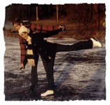
This is an RGB file, not a duotone even though it
resembles a duotone. This is the web (obviously!), so you can't see a
true duotone here. Remember that duotones are for PRINT ONLY! |
In a page layout program (QuarkXPress, or InDesign), RGB pictures will separate into CMYK when going to a printing press (but ideally should be converted first while in Photoshop if you're going to a printing press!). CMYK pictures will of course separate into the four component colors - cyan, magenta, yellow, and black. However, a true duotone EPS file will separate into Black (usually) and another color. The second color in a duotone are usually premixed Pantone colors, and they are usually chosen from printed swatch books to use in the design or to match colors specified by a client. Client choices are often made to match a specific logo color.
Steps to create a duotone:
Open a grayscale or a color photo. Use 07Final.psd in Exercises 4. Convert to grayscale if it is a color image.
Convert to duotone (Image>Mode>Duotone), and pick a second color.
If a preset duotone is not loaded ("Load..." button...), then the color is not very discernable. Color dominance is affected by the duotone curve shape. The default straight line curve is NOT the ideal curve to use for a number of reasons.
Load a preset duotone from the Applications>Adobe Photoshop CS5>Presets> Duotones>Duotones>Pantone(R) Duotones folder in the Photoshop folder and compare to the original.
Modify a preset by changing the Pantone color (Click on the color thumbnail in the Duotone Options dialog box). It is best to start with a similar color before you begin to change it.
Halftone Screen Angles
In commercial printing, rows of dots make up the simulated grays or color shades
in a picture. The rows are placed at various angles to work best. Black is
always printed at an angle of 45 degrees.
Typical process color (CMYK) angles: Black 45 degrees Cyan 15 degrees Magenta 75 degrees Yellow 90 degrees
In Photoshop, the default screen for duotone inks is often the same screen angle (i.e. 45 degrees) for every color. That won't work! If screen angles are set incorrectly, moire patterns may result. Sometimes they are so bad that the print job is useless.
To print well on a printing press the two colors in a duotone must have different screen angles. The printing company should be able to tell you what screen angle and screen frequency to use. If the printer cannot tell you much or you don't know what printing company will be employed, set black at 45 degrees, and use either the cyan or magenta screen angle from the table above.
It should be noted that some printshops or halftone trade shops (like Metro Trade in Columbus, OH, phone 614-461-9076) prefer that all duotone inks be set at screen angles 30 degrees between black and the second ink. In the chart above, both 15 degrees and 75 degrees for a screen angle meet this requirement. Whatever you choose, make sure that the lightest printing color is the one set at other than 45 degrees.
Halftone Screen Frequency
Screen frequency is how many rows of printed halftone dots fit into an inch. The
measurement for this is "lines per inch" in the USA. Screen frequency is limited
by the type of paper and printing
press used. While we'd like them to be very high to make them invisible, the
real-world limitations of paper and printing press impose an upper limit. The
more porous and absorbent the paper, the lower/coarser the screen
frequency is because of the spreading of ink on the paper. All high-quality printing using
133 lpi or higher is on coated paper to control ink spread.Newsprint is usually
a fairly coarse 85 to 100 lines per inch, while magazines traditionally
use 133 to 150 lines per inch.
Set a custom duotone screen. - see note below
the lined out section...
File> Print with Preview..., choose the Output settings from the drop down list (be sure that Show More Options is checked), and click on the "Screen..." button. Deselect the Use Printer's Default Screens check box. Set up each screen individually or use the Auto button and input your line screen frequency. Most print shops will tell the designer what screen frequency to use based on press characteristics, paper stock, etc.
In this exercise we will purposely exaggerate the screen so that it can be seen with the unaided eye. Choose a very coarse 20 lpi for the screen. Note that this screen is very coarse for purposes of illustration. It would almost never be used in a real print job. More traditional screens would be used (i.e. 85 to 100 lpi for newsprint, 133 lpi for glossy stock, 150-200 lpi for fine book reproductions, etc.).
Select "Round" in the Shape drop down list and click on the the Use Same Shape for All Inks. In a real-world job, ask the printer which halftone dot shape they prefer (Diamond, Round, etc.).
Frequency should be the same for both inks, but the screen angle must be different for each ink. Use 45 degrees for black ink, and either 75 or 15 degrees for the second color ink screen angle unless you choose the Auto screen setup.
After the screens are set up in the Print Preview dialog box, click Done
NOTE: Photoshop's Help menu provides this information (and more) about setting up screens in Duotones. It's a nicely done Help topic because it is so important to the success of a real Duotone print job.
Saving a Duotone File with Screen Information
Save the picture as an EPS file with the Save Halftone screen box checked. If the box is not checked, then both duotone screens will print with the same angle to the laser printer - the screen settings you specified in Photoshop's Page Setup will not have any affect.
NOTE: Sadly, the ability to set halftone screens and dot shape has been removed from Photoshop CS5. This is angrily reported on the Adobe User forum at http://forums.adobe.com/message/2955216
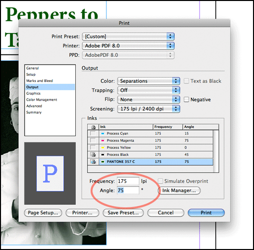
The ability to set screen angles for spot colors exists in InDesign, but there appears to be no control over halftone dot shape (round vs. elliptical, vs diamond, etc.) as there was in older versions of Photoshop. The screen capture below comes from InDesign's Print dialog box (File>Print). Navigate to the Output section of the dialog box, choose your printer (print settings will change with different printers), select a screen frequency based upon the type of paper used, and be sure to change the screen angle for the second color. It defaulted to 45 degrees on my copy (the same screen angle as black), which would be a printing disaster if the printing service didn't catch it either. Uncheck any unused colors (in my case below, I unchecked Cyan, Magenta, and Yellow) so that you don't accidentally print empty negatives (and be charged for them!).
Illustrator also has a similar Print dialog box with nearly the same options as InDesign. The steps outlined above should work there too.
Creating "Torn Paper" Artistic Edges on Photographs
There exist a series of third-party plug-ins for Photoshop that apply rough edges to a photograph or
other illustration. The available styles of edges make it appear as a Polaroid print, or
an alternative process with brushed edges, or other choices. One such company is AutoFX
located at http://www.autofx.com if you wish to
purchase one of their Photoshop Plug-ins to do photo edges.
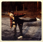
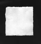
A creative person can create their own rough edges for photos though it involves a few more steps than the plug-in. The example below is for a torn edge paper appearance and uses the two files called 70s skating.jpg and torn paper.jpg in Exercises 4.
 |
+ |
 |
= |
 |
| Original photo | Scanned paper w/ black background | Rough edges on photo |
The steps are as follows:
Open both files - torn paper.jpg and the 70s skating.jpg pictures (Exercises 4).
TIP: The rough edges that will eventually surround the photo were made by scanning a sheet of torn paper. When making your own torn paper edges, try wetting the tear line with water to produce a pleasing texture on the edges.If needed, adjust the color of the faded skating photograph using the Curves or Levels.
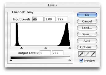
Adjust the levels (Image>Adjustments>Levels) of the torn paper file to make the background area 100% black. The settings should be similar to that shown below.
The white of the paper still has some tone to it, and a slight tone at the edges is desirable. However, the center part of the picture should be pure white (255, 255, 255) to allow the photo to show through undisturbed.To make the center a pure white color, first use the Rectangular Marquee tool to select the center of the picture.
Feather the selection about 20 pixels for this example. [Select>Modify>Feather]. Use a larger feather for higher resolution pictures, and less feather for 72 dpi screen resolution pictures.
Fill with white. (Edit>Fill, and select White for contents and fill the feathered selection.)
Deselect.
Dress up any areas near the edge that shouldn't have tone using the Paintbrush tool with medium to low opacity settings.
Select All (Command-A)Copy (Command-C)
Click on the 70s skating picture to make it the active picture now.
Paste the copied paper w/edges picture into the skating picture (Command-V is the shortcut). This makes a new layer with the torn paper in it.
Change the Opacity of the torn paper layer to less than 100% so you can see the photo beneath.
Edit>Transform>Scale to adjust the size of the torn paper to cover the part of the picture you want to keep.
Adjust Opacity back to 100% for the torn paper layer.
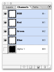
Click on the Channels tab to show the picture's channels.
Drag the RGB channel onto the make selection from channel icon (dashed circle).Now click the Save Selection as Channel icon (gray box w/ circle inside) to create an Alpha channel.
Deselect.
Click on the RGB channel to make sure it's active.
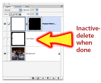
Click on the Layers tab to return to the layer view.
Hide the torn paper layer by click on the eye icon next to the layer in the layers palette.
Create another new layer by clicking the Create New Layer icon (upturned page icon) in the layers palette.
Fill it with white (Edit> Fill, choose White as contents.) You should see a new layer completely filled with white.Return to the Channels Palette by clicking on the Channels tab.
Drag the newly created channel (Alpha 1) to the Load Channel as Selection button in the Channels palette (dashed circle icon). A marching ant marquee should appear in the shape of the torn paper shape.
Return to the Layers palette by clicking on the Layers tab.
On the white-filled layer, add a new Layer Mask using the selection. (Layer> Add Layer Mask > Hide Selection. Note: If Hide Selection doesn't work, then Undo, and try using Reveal Selection instead. It all depends on the mask preferences settings within your copy of Photoshop.)
Crop to suite.TIP: Other rough edged elements may be used also. Examples may include a roughly brushed paint edge, a perforated metal edge, aluminum foil scanned and treated with a strong levels adjustment, and scanned Polaroid print edges. Use your imagination!
Note: If the textured shape is black on white, you can quickly reverse the tones by using Image > Adjustments > Invert.
GIF animation using Photoshop
Animated GIF files are useful for web publishing purposes.
Click here for some sample GIF animations.
They must be kept small however, or they will not work properly. For example, do not try to animate a full-screen image -- it may exceed the capability of the program or the computer hardware.
Photoshop versions 6.0 through CS2 included Adobe ImageReady software program that created animations, rollovers, and other web-effects. This changed starting in Photoshop CS3 and animations are now made directly in Photoshop.
To create an animation, make a file and add additional layers for each step in your animation. Each layer up in the stack should be the next frame in the animation - think of going from bottom to top in the stack for the order of the animation sequence. TIP: You can temporarily adjust each layer's Opacity setting (Layers palette, upper right) to see the layer underneath made previously. This will help you align the individual frames properly.
Save the layered file as a PSD when you have completed making the animation layers.
Choose Window>Animation to show the Animation Palette.
By default, the Animation palette will show Timeline animation, but I prefer to use the simpler Frame Animation mode. To convert to Frame Animation, click the upper right button in the Animation palette, and scroll to Convert to Frame Animation.
Layers in the original Photoshop file can be made into animation frames. To do this, click the upper right button in the Animation Palette again, and choose Make Frames from Layers. (Note: you may have to scroll down the list to see the Make Frames from Layers choice.)
After the above steps, your Animation Palette should look something like this...
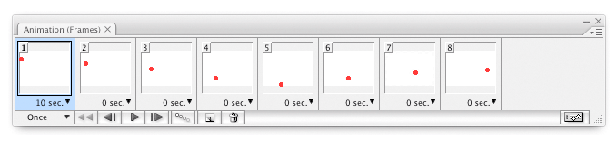
The Animation window will be updated automatically with frames showing each step of the animation. If you want the animation to run as fast as it can on each individual machine, make sure each frame has 0 sec. frame time delay. You can change the time each frame displays by clicking on the delay time underneath each frame. In the picture above, you can see that the first frame will display for 10 seconds (displayed beneath the first frame), and all subsequent frames will display as fast as the computer can show them (0 sec displayed).
If you wish to set the frame delay to a fixed amount for all frames, choose Select All Frames (upper right button in the palette), and then set the time delay of one frame to the desired amount. All other frames should be updated with the new amount. Generally a 0.1 second delay works fine with most animations.
The animation can be previewed by pressing the Play Animation button at the bottom of the Animation window.
Once it looks OK, save the file by choosing File, Save For Web & Devices..., and check the looping option you desire (Forever, Once, or Custom). Click the Save button at the top right of the box. In the next dialog box, choose the desired location for the saved file, and choose Images Only in the Format list.
For an animated GIF file, the filename should end in .gif and that should be automatically appended by Photoshop if you choose Images Only in the Save dialog box. Check to make sure your file is a GIF file. If not, you made a mistake.
To test any GIF animation file, open a browser window (Safari, Internet Explorer, etc.), and drag the saved file's icon into the browser's window. The browser will play the animation as if it were being viewed online. This is a great way to see if the intended animation plays well, or if the file needs adjustments.
Animations created in Photoshop can also be exported to other animation formats. (File>Export>Render Video) You can choose from a variety of animated formats including QuickTime Movie, AVI, MPEG-4, Flash Video (FLV) and other formats in the drop-down list. Some of these choices provide for millions of colors instead of the GIF file's 256 color limit. Exports can be edited and combined with sound in the inexpensive ($29.99 as of 7/2007) QuickTime authoring program available from Apple for both Macs and PCs. Be aware that video file exports will demand much more space and produce much larger files than a simple animated GIF.
A sample animation that I created can be found at https://www.afterness.com/digital/images/bill_aim.gif
Here's another animation... https://www.afterness.com/smiley-dad.gif
TIP: Sometimes where you are working with a large stack of layers in the Layers palette, you can quickly hide or reveal the upper layers by clicking and dragging down the visibility icons (eyes). Click-dragging quickly toggles all the layers you roll over to either on or off.
Editing Video in Extended version of Photoshop
This section has been moved to
Meeting 18. If you want to read ahead to learn the very basics of editing
video in Photoshop, click the link to go to the meeting notes.
The same Animation palette will be used as in the simple exercise shown
above, but the Timeline mode of the palette will be used instead of the Frame
mode when working with video.
Creating Java Script Rollovers in ImageReady
OBSOLETE information. ImageReady is no longer a separate program in the Adobe
bundle. It's still worth a look at Rollovers though.
A rollover is an image that changes state when a mouse moves over it on a web
page. One example might be some words that change color to indicate that they
are a link to another page. It adds some interactive pizzazz to a web page. Roll
your mouse over the text below to see how a rollover works:

Here's another rollover saved as a pair of jpg files. Again, roll your mouse over the picture to toggle between the two pictures to clearly show "before and after" retouching in the picture :
 |
Copyright 2006 William R Schneider All Rights Reserved |
Begin by creating a two-layer illustration in Photoshop (or even in ImageReady). One layer is normally displayed, and the other one is to be displayed when a mouse moves over the image. Rearrange layers to place the normal image on the top, and the mouseover layer on the bottom layer. An example of such an image, mouse_me.psd can be found in Exercises 7
If you created the illustration in Photoshop, click the button to switch to ImageReady when the illustration is complete.
In the Web Content Palette, click the upturned page icon at the bottom. This creates a new Rollover state listed under Slices.
With the new state (usually called the "Over" state) selected as the active one, click the eye icon in the top layer in ImageReady's Layers palette to hide it from view. The new state's appearance should change to reflect the new appearance.
To preview the action of the rollover in ImageReady, click the "pointing finger" preview icon near the bottom of the tool palette, then move your mouse into the artwork to see how it works. If you're satisified at this point, the rollover is complete, and all you have to do is to save it as an HTML file through File, Save Optimized As...
Drag the newly created HTML file onto an open browser window to preview the Rollover in a browser.
To employ the code that ImageReady created for the rollover, you must cut and paste parts of it in various sections of the html code for your web page. The following is meant to be a brief set of instructions for dissecting the rollover code and where to use it on a web page. (For code-heads only):
- The section of the code that begins with "<!-- ImageReady Preload Script" and ends with "<!-- End Preload Script -->" needs to go in the Head section at the top of the web page.
- The line of code ONLOAD="preloadImages();" needs to go in the Body line between the pointed brackets within the web page.
- Finally, the few lines that begin with "<!-- ImageReady Slices" and end with "<!-- End ImageReady Slices -->"need to go on the webpage or into a table positioned where you want them to appear. If you want a hyperlink, be sure to change the HREF argument to something other than a #.
I created some demo Java Rollovers using manual coding before Adobe ImageReady and they can be viewed at:
https://www.afterness.com/demojavafolder
NOTE - because these are hand coded using 5-year old Java script, it may not display properly in current browsers.
Slices
Slices are a web-based feature of Photoshop that cut up a document into
different parts. Each part, or 'slice', gets saved as a separate image when you
perform a File>Save for Web & Devices. You can identify some slices to be
text blocks where whatever text you desire can be added later. The save function can be used to also
save a web page that includes the slices for further tweaking in a web design
program. Slices aren't used much anymore, but just in case, here's a basic
introduction.
One handy use for slices is to be able to mock up a complex web page in Photoshop and to be able to export it as a complete html web page without much trouble. Another use for slices is to create advanced navigational bars where all the graphics are contained within one Photoshop document for simplicity and consistent style. One advantage to using slices is that the slices, if repeated on each page of the web site, need to be downloaded only once. They get "cached" in the web browser. Subsequent displays of the same graphics on other web pages are quicker because the graphic has been saved to the web browser's cache.
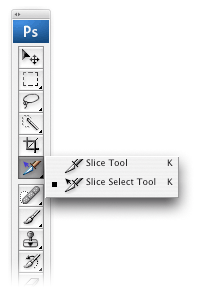
To use slices, create or open a document in Photoshop, and click the slice tool from the Tools palette.
(for the in-class example, use the file slice_me.psd from Exercises 7)
 |
Click and drag the slice tool in your document to
create a rectangular slice. Photoshop will automatically number
the slice and the current slice will be surrounded by a brown outline.
You can drag the slice handles to resize them if needed. If you make
additional slices, the slices you are not working on will be shown with
a blue outline. If you have guidelines present in your document, you may choose Slices From Guides on the Options Bar to automatically generate them. Some slices will be automatically generated depending on where you created the first slice. For example, if you start the corner of your first slice well inside the picture, the other parts of the picture will be automatically divided so that your slice will fit in a grid. To choose between slices, use the Slice Select Tool. NOTE: In CS5, the Slice Tool is grouped with the Crop tool. When the Slice Select tool is chosen, you may set slice options by clicking on the lined folder icon on the Options Bar (at the top of the screen) or by double-clicking on the slice. This will allow you to individually name your slices for when they get saved as separate images as well as changing other options (i.e., converting a slice into a text box, etc). |
When you are satisfied with the way the slices are arranged, File>Save for Web & Devices will open a dialogue box where you can select which kind of file you wish to save each slice (GIF vs. JPEG) and other web options. Individual slices may be saved different ways -- i.e. a block that contains mostly simple graphics and display type can be saved as a GIF file, while a photograph included in the design can be saved as a JPG file.
To align text to the top of a slice, double-click the slice containing the text in the Save for Web and Devices dialog box, and choose alignments you desire. (NOTE: I've noticed that carriage returns are not honored here, and that you have to open the resulting file in a web page editor to insert line breaks.)
When you click Save, another dialog box opens where you can choose between "HTML and Images", "HTML Only", and "Images Only". Save as "HTML and Images" so you can edit the page itself in a web page editor later on. Save the documents into a new folder you create to capture all the pictures and HTML code generated.
The result of this slicing exercise can be found on the web here. It's just one demo page, and most links are not active.
Picture Size for Slices
Web designers target either an 800x600 pixel screen (~20% of users have this) or
sometimes a larger 1024x768 pixel screen ( ~80% of users have this) for professionals in
the visual fields (i.e. you are going to design a portfolio to be seen by
graphic designers who typically have larger screens than general users.)
In order to accommodate scroll bars and menus, one notable web designer says to create a 760x420 pixel page for users that have 800x600 screens, and to create a 955x600 pixel page for1024x768 screens.
| Display Size (pixels) | Web page size (pixels) | |
| 800 x 600 | -- | 760 x 420 |
| 1024 x 768 | -- | 955 x 600 |
Student File Storage and Web Space on OAK (Note: OAK
server space has been decommissioned. I'm not sure if there is going to be a replacement for students.)
To experiment with web pages, slices, or with animated GIF files served on the
web, enable your personal web site through OAK.
Follow this link for instructions on how to do this (student_web_space.html)
Once enabled, you can manage your web pages and files with drag and drop ease.
y
| Technical Exercises 8: | Turn-in_08 folder - Due May 25 |
| 1. Create an animated GIF file of text of your own name changing somehow. It can change color, get a "glow" around it, dissolve away, move into or out of the frame, explode, or any other transition you choose to employ. Make at least 5 different steps in the animation. Let's keep the size under 500 pixels wide by 300 pixels high. TIP: You may have to make blank layers under each type layer because of how type layers are normally transparent. Don't forget that you can Rasterize each type layer if you need to have them act like normal layers. | |
| Checklist of Specifications for the Assignment: | |
| Number of pictures: | 1 picture |
| Picture size: | 5x7 inch minimum |
| Resolution: | 200 pixels per inch minimum |
| Color space: | Adobe RGB (1998) for RGB pictures, or grayscale Dot Gain 20%. |
| Text OK?: | NO, unless it's part of a scan you are using (book page, etc.) |
| Content: | Community calendar topic - see wordy description below |
| Print Required? | Yes |
| Print specs: | Portfolio-quality print on 8-1/2 x 11 inch (letter-sized) paper |
| File format: | JPEG, quality 7 or higher |
| Identification: | Put YOUR LAST NAME as the first word of the filename. |
| Assets Folder: | Required - see note below chart. |
| Destination: | Creative_03 folder |
Notes: All digitized content (scans, digital photos, etc.) used in the making of your creative assignment must be submitted in a separate "assets" folder named "lastname_assets" (substituting your own name, of course.) This folder is due on the day that the assignment is due. Please don't copy your completed assignment into the folder though.
If the assignments don't meet the specifications given above, they won't be considered for a grade. That means if a file is submitted in sRGB instead of AdobeRGB, it gets a failing grade. Not having a quality print, not having a content folder with all contents, or not meeting the minimum picture size or resolution also results in a zero for the assignment. Please pay attention to the assignment specifications!
Community Event Publicity
Create a promotional illustration for a flyer or brochure advertising an upcoming community event in the SE Ohio area. Events are listed on the community calendar web site at http://www.publicbroadcasting.net/woub/events.eventsmain. Do NOT place text within your Photoshop file! Create the illustration ONLY. You are the illustrator here, not the designer of the poster.Pictures must be a minimum of 5" x 7" at 200 dpi minimum so that they will print well. Picture files must also be submitted in the AdobeRGB (1998) working space. If pictures do not meet the minimum size/resolution or working space requirements, they will be given a failing grade!
Do not resample pictures upward if you start with a low resolution scan or it will have inferior quality. If pictures do not meet the minimum size/resolution requirement or have been obviously "upsized", they will be given a failing grade!
Submit the file in JPEG format (Quality 7 or higher) to save server space, but be sure to also save the original layered file for your own future needs.
Place file into the Creative #3 folder plus submit a portfolio quality 8-1/2 x 11 inch Epson print of the assignment. (The Creative_03 folder will be closed until the day the assignment is due.) The quality of the print will be evaluated as part of the score for this assignment. Due at the beginning of class.
Tips for a better grade on creative assignments...
Due Dates:
May 29 TTh Class
May 30 MW Class
![]()