Meeting 9
Meglio un uovo oggi che una gallina domani
Topics: Simple Methods for Creating Collages, Multiple Selections using the Quick Mask
tool, Adjustment Layers, Introduction to tracing software.
Stump the Chump
Toning steps for a picture.
Collage Review
Demonstrate how to create a collage by dragging a selected object from
another open file. Begin by dragging one whole file onto another and erasing away part of
the top layer to create a composite.
Open both Grayscale Church.tif and Great taste.tif.
Select>All of great taste.tif . (Command-A is the keyboard shortcut for Select>All).
Click the Move tool (or press V for the shortcut).
Drag great taste.tif onto Grayscale Church. Check the layers palette to see that two layers exist.
Choose the upper layer (Click on its name).
With the Eraser tool (E), erase the truck and other objects leaving just the hungry women on the top layer.
Then start again, this time by selecting just a part of the "great taste" file.
Deselect any selected areas on either file. (Select>Deselect or type a Command-D)
Select just the truck with the lasso tool.
Choose the Move tool (V).
Drag the truck selection on top of the church file.
Position the new layer as desired using the Move tool.
Resize the new layer by selecting Edit>Transform>Scale. Be sure to hold the Shift key to size the picture proportionally.
Duplicate the new layer a couple of times by dragging the layer to the New Layer icon (upturned page) located at the bottom of the Layers Palette. Resize them to match the perspective of the scene.
Done.
Quick Mask tool Review
Review using the quick mask mode for dodging and burning. Also show how setting the
gradient fill tool to Foreground to Transparent can be used to make multiple selection
areas (i.e., corners) for further dodging or burning.
Multiple Selection Areas exercise
Open Dageur.jpg (Exercises 5) for demos.
Set Default colors in the Tool Box (press "D")
Check to be sure that Quick-Mask mode is set to Color indicates Selected Area (double click on the Quick Mask icon to get the dialog box).
Choose the Gradient Fill tool to drag out a gradient from a corner inward. Don't drag completely to the center of the photo.
First, try one corner at a time. Tedious, eh?
Now use the Gradient tool set to foreground to transparent on the Options bar (click the blue arrow next to the gradient preview on the Options bar to change), and select all four corners of the picture simultaneously. You are adding additional areas to your eventual selection by the additional gradient tool drags.
Click back to Standard Mode (this step is a MUST - otherwise changes made in the quick mask mode affect the mask ONLY - not the picture itself).
Image>Adjustments>Levels to darken all selected areas simultaneously.
Adjustment Layers in Photoshop
Adjustment Layers provide a powerful way to edit picture using Levels, Curves, Hue and Saturation, Threshold, and much more. They behave like additional layers in an image, and do not become a permanent part of the picture unless the layers are flattened. Adjustment Layers have substantial advantages over traditional ways of modifying picture tones and colors. They do result in larger files though.
Open Musicians.tif (Exercises 1).
First, use Image>Adjustments>Levels to make a severe change in the picture tones. Then choose Image> Adjustments>Levels again to show how the original tones cannot be restored to the photograph after the initial editing.
File>Revert to reopen the original file for a demonstration using Adjustment Layers.
Click on the black and white circular icon (new adjustment layer) at the bottom of the Layers Palette. Select Levels from the list that displays to create a Levels Adjustment Layer.
The histogram appears and levels can be adjusted to improve the picture. Click OK to save the Adjustment Layer.
Experiment with turning the Adjustment Layer visibility on and off. Also, reopen the Adjustment Layer for further editing with a double click on the histogram icon in the Layers Palette.
You may select a small part of a picture and create a new Adjustment Layer for toning only the selected area. Adjustment Layers may be stacked on top of each other.
IMPORTANT DISTINCTION: Editing an Adjustment Layer does not discard picture information as does editing tones using the Image>Adjustments>Levels method. Generally, re-editing levels using Image>Adjustments>Levels several times makes the photograph deteriorate enough to be unsuitable for accurate reproduction. However, using an Adjustment Layer is much more flexible because it does not permanently affect the pixel values in the underlying image.
If an Adjustment Layer proves to be unwanted, it may be discarded by dragging it into the small trash can icon in the lower right corner of the Layers Palette. If you are happy with the changes made to an image by an adjustment layer, you can flatten the image to permanently apply the changes made by the layer (use the Layers Palette, click on the upper right arrow in the little circle, choose Flatten Image).
Using the Adjustment Layer feature with Multiple Selection Exercise
Open Dageur.jpg (Exercises 5).
Change Quick Mask mode to Color indicates Selected area (dbl-click on Quick Mask icon to get dialog box).
Then use the Gradient tool with the foreground to transparent option (see the gradient preview area found on the Options Bar), and select all four corners individually and edges. All corner and edge selections become cumulative when using the foreground to transparent option.
Click back to Standard Mode to show the marching ants. (Changing back to Standard mode is NECESSARY - changes made in the quick mask mode affect the mask ONLY.)
NOTE: So far, all the steps in this section are the same as the example given earlier in the lecture. Now come the Adjustment Layer steps:
Click the b/w circle icon at the bottom of the Layers Palette to create a new adjustment layer. Choose Levels as the type of adjustment layer you want.
Make adjustments to the levels histogram and click OK.
The advantage to making an Adjustment layer is that it may be edited later to make changes. Adjustments can be completely thrown away in the Layers trash can if desired. Adjustment levels may be stacked on top of each other, and any one of them edited at any later time.
Here's another trick using Adjustment Layers -- you may have multiple adjustment layers to color-correct an image for two or more printers that have different color/tonal rendering. For example, with two printers - one that prints a bit greenish and another that prints a bit dark -- you may have the color corrections included as different adjustment layers, and have only the applicable adjustment layer active (visible) when printing to one of the printers. For the printer that prints too green, you can make the green-corrected Adjustment Layer visible and the other Adjustment Layer not visible when you print to have good color results when printing to that particular printer. Adjustment Layers may be dragged from one open file to another. That way multiple pictures can have the same correction.
Power to the People!
Finally, the most powerful feature of using Adjustment Layers to change the tones in
Photoshop is that they are editable by painting more or less selection onto the layer
mask. If you make a selection using any selection tool (Quick Mask painting, Lasso, or
Magic Wand, etc.) then use an adjustment layer to lighten or darken the selected area, you
can paint onto the Adjustment Layer's mask to change the selected area. For example, if
you paint black onto a Levels Adjustment Layer, you remove the Adjustment Layer's effect
in the painted areas. The painted pattern appears on the Adjustment Layer thumbnail in the
Layers Palette showing just what part of the picture is affected (or not) by the
Adjustment Layer.
I make use of this extensively for complicated dodging and burning tasks. It can be used for other things, and its true power might be revealed more easily using color instead of levels in this following exercise:
Open Musicians.tif.
Convert to RGB mode.
Lasso one of the faces using the Lasso tool.
Add a Hue/Saturation adjustment layer by clicking on the half-filled circle icon at the bottom of the Layers palette.
Click the Colorize check box in the Hue/Saturation dialog box and tweak the hue to colorize the selected part of the picture.
Click OK to accept your changes.
Now lets say we wanted to colorize TWO faces instead of one...
Click on the Hue/Saturation adjustment layer to make sure it is the active layer.
Using the paintbrush or Airbrush tool, paint black on the Adjustment layer on the new face.
It too should acquire the same color as the originally selected face.
Now change the foreground color to white, and paint over the first face.
The color should revert back to the original gray tones.
BIG TIP: If you wish to make an Adjustment Layer affect the pixels on only one layer in a collage and not universally change the whole image, create the adjustment immediately above the layer you want to change. Then Option-click between the two layers to tie it to just the layer to which you wish to adjust. The Adjustment Layer will now affect only the layer directly underneath it in the Layers Palette.
More Tricks with Adjustment Layers - Using Luminosity mode
Adjustment layers can have different modes that are available to any layer
in the Layers palette. These modes are found in the drop-down menu just under
the tab for the Layers palette.
These modes can be useful when toning pictures. For example, increasing contrast in Levels can often over-saturate color in an RGB file. To prevent saturation from increasing when increasing contrast in levels, use a Levels Adjustment Layer, and choose the Luminance mode in the Layers palette before you start adjusting the sliders in the Levels dialog box.
Open Manvioli.tif from Exercises 5 and adjust the black and gray points with a Levels Adjustment Layer to see how this behaves.
A levels change made the old way (Image>Adjustments>Levels) can still be set to Luminosity mode to cancel the excess saturation. After a levels toning change, immediately choose Edit>Fade and set the mode to Luminosity without changing anything else. Of course the limitation is that you can't edit the toning changes made to the picture if the results you see using Luminosity aren't optimum.
Another trick using Adjustment Layers - Custom Grayscale Conversions
Open file bw_cupids_chapel edit.psd from Exercises 3 for this exercise. It takes
two Hue/Saturation adjustment layers to convert color to b/w in a way that
mimics the use of colored lens filters with b/w film.
The first Hue/Saturation adjustment layer above the Background will be in Color mode. Let's call this the filter layer.
The second Hue/Saturation adjustment layer at the top of the stack is the desaturate layer. The Saturation slider will be positioned all the way to the left to remove hue from the picture.
Once these layers are positioned, open the filter layer and slide the hue left and right to see the effect on your picture. There are places that mimic the use of red filters with b/w film, and a host of others too.
Setting Levels and Curves Options for Best Results when using Auto
The versions of Photoshop prior to CS3 had a rather poor set of options for
automatically correcting tone and color in photographs. There are additional
options in CS3 that make Auto toning viable. The defaults for Auto need to be changed
to realize the advantages.
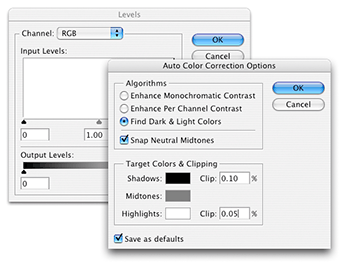
Open either Image>Adjustments>Levels (or Curves) and click the Options button. You should see a dialog box like the one shown below. Change the settings to those shown below.

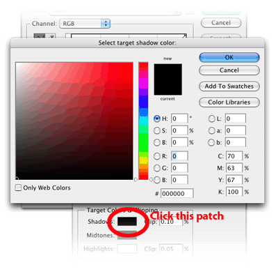
Next, click on the Shadows patch in this dialog box (see location in illustration below). The Select target shadow color dialog box appears, and set the values in RGB to 0,0,0 as shown below. Click OK.

After setting the shadow target, then click the Highlights color patch and set RGB values to 249,249,249 in a similar way you did for the shadows. Click OK to return to the Auto Color Corrections dialog box.
Click the Save as Defaults box at the bottom. Click OK.
After the defaults have been changed to the settings shown above, Auto color should work better than in past versions of Photoshop.
Shadow/Highlight
Found in Image>Adjustments is the Shadow/Highlight dialog box. It is an advanced
dodging and burning tool that can easily lighten the seriously dark parts of a
photograph, or bring out all possible tone in a very light area of a photograph
(snow, white shirt, etc.) that may be on the verge of blowing out. Some
photographers affectionately call this the "fill flash" tool because of its
effectiveness when lightening shadows in underexposed photographs.

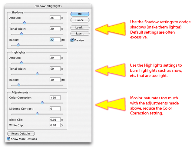
The defaults are often excessive, so use good judgment when viewing the results of this control. Too-strong settings can often produce a halo around darker objects - be careful not to do that.
The Amount setting controls the amount of lightening (in the Shadows section) or darkening (in the Highlights section).
Tonal Width controls how many dark tones are affected by the Amount setting. A low setting in the Shadows section works on only the darkest tones, leaving the rest unaffected. A higher setting in Tonal Width includes additional tones that are somewhat lighter than the darkest shadows.
The Radius setting is used to control the area being lightened (in Shadows) or darkened (in Highlights) It is essentially a mask that selects the shadow tones or highlight tones. If the Radius is set too high, a larger halo around objects can be seen.
As mentioned before, this tool can easily be overdone and the picture starts to look artificial. Use this tool wisely.
Intro to Tracing Software - Translation Utility that converts Raster art to Vector art.
In the recent past, Adobe Streamline was a stand-alone program
that converted raster artwork (a grid of pixels) into vector artwork (vector
outlines). Adobe has not updated Streamline software because the trace
capability is now part of Adobe Illustrator.
Tracing programs were used as an aid to move bitmap images into Freehand,
Illustrator or CorelDraw for further editing as vector shapes. A good use of a
tracing utility is
to trace a scanned logo for further editing in Freehand, Illustrator, or
CorelDraw. These are vector editing programs that create artwork in a
very different way than Photoshop.
It is also possible to move Freehand, Illustrator, or CorelDraw images into Photoshop for applying bitmap effects like Gaussian blur. (To get these files into Photoshop, they must be exported from Freehand or CorelDraw as bitmaps, or as AI or EPS vector files. AI and EPS files usually import OK but they get rasterized (converted to bitmaps) by Photoshop upon import.)
Working with scanned bitmaps:
Launch Adobe Illustrator.Create a new document with a Print document profile for this exercise (web settings work also, but will provide a default 800x600 pixel RGB picture space.
File>Place globe.tif (Exercises 3).
Choose Object>Live Trace>Make (or you can choose Live Trace from the Control Palette (located at the top where the Options Bars is located in Photoshop)
This will trace the original raster artwork and convert it to vector art. One substantial benefit is that it will reduce the jaggies present in small originals like the globe.tif picture.
Working with scanned photos:
File>NewPlace JUSTMAN.TIF (Exercises 3)
On the Control Palette (called Options bar in Photoshop), click the drop-down area, and choose Photo Low Fidelity.
Note how it posterizes the grayscale image into a limited number of colors/tones.
Experiment with other presets in the Tracing Options dialog box. This experimentation must be done before the artwork is Expanded (Control Palette at the top). Be sure that you check the Preview button before you experiment.
The posterized image can be converted to a line drawing by first Expanding the picture (Control Palette), selecting all, then choosing no fill and a 0.5 to 1.5 point outline in the Control Palette.
Tech Exercise 5: Turn-In_05 folder - Due May 4 Correct the tones in OLD PICNIC.JPG (Exercises 5) by dodging and burning and overall levels adjustment. Using QuickMask mode makes the blending easier. Note: the tabletop is blown-out. You can't fix a blown-out area by burning. If you try, all you do is make ugly JPG compression artifacts (square areas) more visible.
Save the file as a JPG for submission.