Meeting 17
Il riso fa buon sangue
Topics: Color Management, Monitor Calibration, Photoshop's Color Working Space,
Printer Profiles, and Color Managed Workflows to Epson and other printers.
| Exercise Folder |
Filename |
| #4 |
PDI Target small.tif |
| Other Stuff |
10 bit test ramp.psd |
Color Management
The goal of Color Management is to be able to get WYSIWYG (What You See Is What You Get)
- displaying consistent color on all devices from monitors to printers. For most
colors, a good color management system is able to maintain color accuracy across
different devices. However there exist some difficult colors. Each device
(monitor, printer, etc.) has a range of colors that it can reproduce, called its
color gamut. There are some colors that a file might include, but can't be
displayed. These are called out-of-gamut colors for the device or reproduction
that can't handle them. It is common to have some colors that can be
faithfully reproduced on one device (i.e. monitor) but can't be reproduced on
another (i.e. CMYK printing). In one familiar gamut mismatch example, most monitors
can show intense greens that can't be reproduced on paper. In addition to
maintaining accurate color with in-gamut colors, color management includes
capability for handling out-of-gamut colors. In photos, for example, it maps an
out-of-gamut color to the nearest color that can be displayed.
The link below will download a lengthy PDF document to your machine that describes
color management issues that are a significant part of Photoshop 5's workflow. This large
6MB file requires Adobe Acrobat reader. Download ps_cms.pdf now
from Bill Schneider's web site, or go to Adobe's web site
for it. While some of it is complicated, the overview in the beginning is a good
introduction to color management.
Monitor Calibration
The single most important task in providing a good color-managed system is to calibrate
your monitor, and write a monitor color profile that describes the monitor's
characteristics to the operating system. Monitor profiles are stored in various locations
depending on the OS used:
Max OSX------------Library>ColorSync>Profiles
Windows XP & Windows 7---------Windows>System32>Spool>drivers>color
On a Mac, you can calibrate your monitor visually by going to System
Preferences, clicking on Displays, and choosing the Color button. You can click a
"canned" profile that contains information
about the phosphor color of your monitor, and fine tune the monitor's appearance
by clicking the Calibrate button. You will be guided through a series of dialog boxes that calibrate your monitor as
close as possible without a hardware calibrator device. If not done correctly
though, you may end up with color worse than before. As long as you don't
overwrite the original monitor profile, you can always revert to a previous
calibration.
When you are calibrating, choose a 2.2 gamma for the monitor (for OSX Snow
Leopard and later, and for all Windows computers), and choose 6500K (D65) as the color temperature of the white point
(both Mac and Windows). Choosing a
warmer color temperature (i.e., D50) often makes the display excessively dark and limits
its ability to display a full color gamut, and should be chosen only when working in
an environment using calibrated
illumination.
When you save the new color profile you made, be sure to give it a new
name so that you don't overwrite an existing profile. You can revert to an older profile
at any time as long as you don't overwrite it.
Hardware-Assisted Monitor Calibration
VisCom uses a XRite/Gretag Macbeth Eye-One for calibrating LCD displays,
and we have recently obtained an XRite Color Munki to use too. These
systems consist of a device that attaches to the front of a monitor, and
accompanying software that displays different colors for the device to evaluate.
The device reads the actual color produced by the monitor, and compares that to
what the software sent. When
complete (it takes about 5 minutes), the software writes a monitor profile to the
ColorSync Folder that informs the computer about the characteristics of that monitor and
sets the monitor to a proper gamma (gamma is similar to a contrast setting for midtones)
and sets the color temperature (the color tint of the white tones). This method is more
accurate than "eyeball" calibration systems like the Mac' s built-in
system.
The devices are relatively inexpensive compared to what they cost just a few years ago.
They are available for both Macs and for Windows PCs. Monitor calibrators from
DataColor include the Spyder4Express ($115) to the more
advanced Spyder4Pro ($170). See their web site at
http://spyder.datacolor.com/index_us.php
for other offerings. The XRite/Gretag Macbeth
i1 system is another
option, and versions of it can calibrate printers. The
ColorMunki is
an affordable XRite calibration device, and it can calibrate both monitors and
printers. The cost is $499 (10/2010), but considerable discounts may be
available to students. (OU students should contact
Midwest Photo in Columbus, OH to inquire.).
As of summer 2011, there is a
ColorMunki Display unit that is less expensive (~$170 street) that is
limited to monitor calibration only. As always, check to see if there are
student discounts available. (Note that the products above and their prices
change quickly. The links/prices/products may go out of date quickly.)
Color Working Spaces in Photoshop
Specifying a suitable device-independent working space is critical to obtaining the best
results when you go to press, or place pictures on the web. There are two
commonly-used color spaces that are important - AdobeRGB(1998) and sRGB.
For commercial printing - use AdobeRGB (1998) for toning before
conversion to CMYK: You MUST change the color space away from sRGB if you desire
top-quality printed output on a printing press. The Adobe-supplied Adobe RGB (1998) is a good color
space to use for preparing RGB pictures for use on commercial presses and the current configuration of our lab's
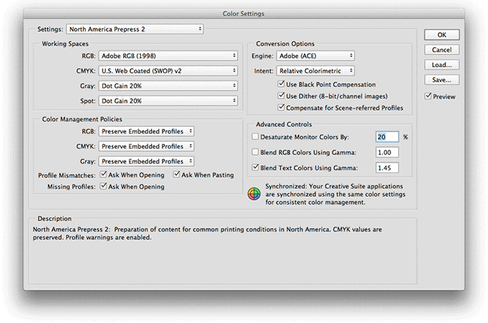
Epson printers. You change the default working space under Edit> Color Settings (in Photoshop on a Macintosh). In the Working
Spaces list, click the RGB drop-down choices, and choose Adobe RGB (1998).
TIP: If
you choose North America Prepress 2 as a setting, Adobe RGB will be
automatically chosen as the default RGB color space.
The goal of a working space is to encompass all the colors that can be printed without
specifying many colors that lie outside. If the working space is too large, there are bits of
color information wasted on colors that can't be reproduced. If the space is too small
like sRGB, then some colors available on the printer will never be used.
VERY IMPORTANT NOTE! - Adobe RGB (1998) is a color WORKING SPACE, not a monitor
profile! If you see this used as a monitor profile on a lab computer in System
Preferences>Displays>Color, you will have
strange colors in your picture when viewed elsewhere or when printed. DO NOT USE
AdobeRGB as a monitor profile!
For the Web, Cell phone, and general consumer uses - use sRGB:
The time to use a working space different from AdobeRGB is when you have to display
the picture in a non-color managed application - like many web browsers and cell
phones. On the
web, sRGB will
often produce a more accurate rendering because of how color numbers are interpreted. sRGB is meant to work best on computers,
phones, and applications
that are not color managed. View this page in your browser to
see a comparison of pictures having different color management tags.
Here is another web site that discusses color management and web browsers -
http://www.gballard.net/psd/go_live_page_profile/embeddedJPEGprofiles.html#.
In this web page, the author identifies several web browsers that are color
managed.
Web browsers have not been color managed until very recently.
In Firefox however, full color
management isn't enabled by default.
Here is a page that has
instructions for configuring it to be fully color managed. It's important to
note that an RGB file on the
web with no color profile tag will be assumed to be sRGB.
Another time using sRGB is desirable is when sending files to online consumer printing services
like Shutterfly. They use the consumer point-and-shoot camera sRGB space to avoid
confusion for their overwhelmingly amateur customer base.
Yet another time to use the smaller sRGB color space is when printing to
office-variety color laser printers. They are consumer devices, and
likely use sRGB to suite their less-sophisticated users.
If you have pictures destined for both print and the web, use
Adobe RGB as your main color space, and create a
Photoshop Action for reducing the color space to sRGB
for versions of the files destined for the web. The web uses smaller files anyway, so you will
need two versions of each file for each purpose.
Converting the Color Working Space of Files
Files in one color working space can be converted to another working space [i.e. sRGB
--> Adobe RGB (1998)] using the Edit>Convert to Profile command. This can
be run at any time on an open file. Photoshop actions may be
employed to quickly convert the color profile of a file with just a keystroke.

See the illustration below for dialog box settings for a conversion from
sRGB to Adobe RGB (1998).
The original color space (Source Space) shows the current color
profile of your file, and the Destination Space shows what it will be
afterward. If necessary, uncheck Flatten Image to Preserve Appearance to
keep a layered file. Click OK to make the change.
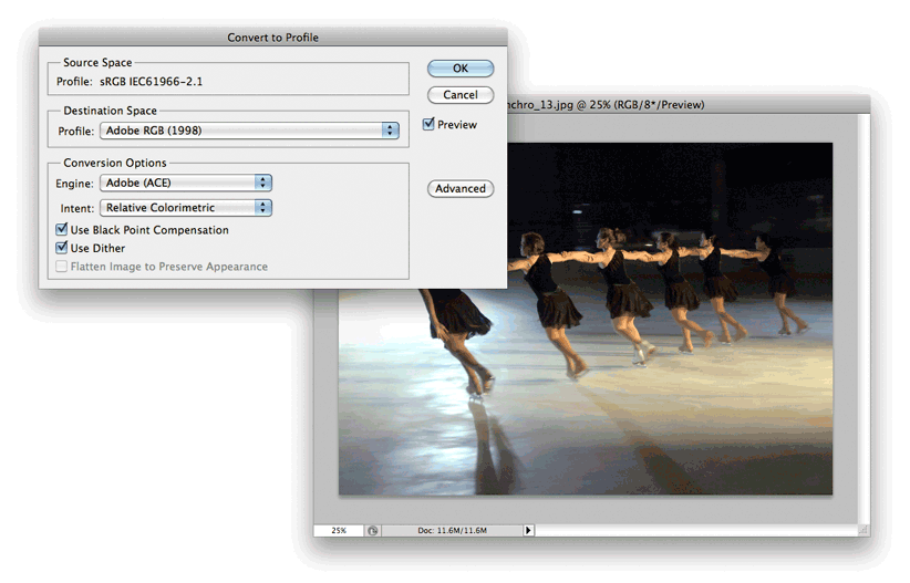
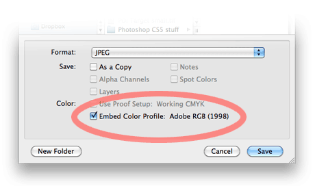
Be sure to save your file afterward, and be sure that you check any Embed
Color Profiles buttons in the File>Save dialog box...
Note 1: Avoid using the Edit>Assign Profile unless you are well-versed in Color
Management principles and understand what you are doing. Chances are that it
will cause improper color shifts
when used without knowledge.
Note 2: When converting files from a small working space (i.e.
sRGB) to a larger working space (i.e. AdobeRGB(1998), the "missing" colors will
not magically reappear. It's similar to converting a grayscale mode picture to
RGB mode. That doesn't add color to the picture either. Therefore it's
best to work in a larger color space, then make a version of the file in the
smaller space as needed.
Note 3: Some companies like Blurb Books will have their own
profiles for you to use. These may be downloadable from the company's web site.
They may also suggest other options to use the bottom half of the Convert to
Profile dialog box. Blurb suggests (as of 2/2014) using Perceptual for the
Intent section, and checking Dither when banding shows in the preview. Look for
banding or posterization in areas having large gradients like an expanse of sky
near the horizon.
Opening Files that are in a Different Working Space than Your Current
Photoshop Defaults:
When a file is opened
having a working space different from the user's default (i.e., opening a sRGB
file on a lab computer set to AdobeRGB as the default in Photoshop), a dialog box appears
alerting the user to the mismatch. In the dialog box, the user can select from the
following choices:
1) Use the file's currently embedded profile (instead of the working space)
2) Convert document's color to the current working space
3) Discard the embedded profile (don't color manage)
Using the document's embedded profile is an acceptable choice when opening files
created elsewhere, unless there is a desire to have all files in a consistent
color space, i.e. AdobeRGB(1998). Converting your files to AdobeRGB (1998) is
needed in our lab if you intend to print your work to the Epson/ColorBurst RIP
printers (VISCOM_RIP).
If the file does not have an embedded color profile, another similar dialog box appears
with the following choices:
1) Leave as is (don't color manage)
2) Assign working RGB
3) Assign Profile
The first choice makes Photoshop act like early, non-color managed versions (up through
version 4). The second choice opens the document and tags it with the current working
space profile (often a good choice, but keep an eye on color shifts). The last
possibility allows the user to assign a specific profile to the file. While not
common, there are times when that could be useful. If you guess wrong on the
last choice in the list, significant color shifts can be expected.
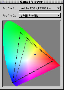
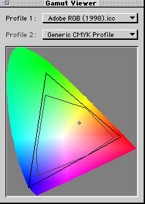
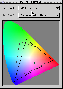
The Color Gamut of Common Working Spaces
Below are screen captures of an X-Rite
ColorShop 2.6 software screen that graphically compares the gamuts of Adobe RGB to
sRGB and to a generic CMYK space, and a comparison between sRGB and CMYK that shows how
much color gamut is clipped by using sRGB..
|
|
|
|
|
Comparison of the Adobe RGB (1998)
working space to sRGB. |
Comparison of the Adobe RGB (1998)
working space to generic CMYK. |
Comparison of sRGB to generic CMYK working spaces. Note how the
CMYK has a larger gamut than sRGB. |
Optionally "Rolling Your Own" Working Spaces
For optimum CMYK commercial printing, a color space popularized by the late Bruce Fraser in his
book Real World Photoshop 6 is used by many. Most users call the color space
"BruceRGB" after the creator. To create this color working space, open Photoshop
and choose Photoshop>Color Settings. Click the Advanced checkbox to enable more choices
in the RGB Working Space drop-down list. Select the "Custom RGB..." setting. In
the dialog box, use the following settings:
Gamma: 2.2
White Point: 6500K (D65)
Red xy: 0.6400 0.3300
Green xy: 0.2800 0.6500
Blue xy: 0.1500 0.0600
Save the new settings as BruceRGB.icm in the System Folder\ColorSync Profiles folder
(Macintosh OS9), or in the Library>ColorSync>Profiles folder (Mac OSX).
For Windows, save the file in the Windows>System32>Spool>Drivers>Color. BruceRGB's color gamut has a slightly reduced green excursion when compared to Adobe RGB
(1998), fitting a bit better in the green range of current-technology CMYK printing.
High-End Monitors having a wide-gamut color space (they show
99% of the colors in AdobeRGB)
Eizo is one brand that serves the high-end photography and design market.
The monitors are very expensive, especially in the large sizes. Other
manufacturers make wide-gamut monitors too, including NEC. While not in the same
league as Eizo or NEC, Benq makes a 27" wide-gamut (99% of AdobeRGB)
for $600.
Here's a link for one of Eizo's smaller 24" wide-gamut monitors
for $800...
https://www.bhphotovideo.com/c/product/1246464-REG/eizo_cs2420_bk_cnx_coloredge_cs2420_24_16_10.html
High Bit-Depth Monitors
Some high-end monitors can display 10-bit per channel color instead of the usual
8-bit color. The NEC PA-series and most of the Eizo monitors mentioned above
include this advanced capability. Using 10-bit color more finely divides the
steps between adjacent colors to avoid posterization, banding, or visible steps
in a gradient.
Using 10-bit color requires much more than just swapping
monitors. Your video card must support it, the drivers for the card must be
10-bit capable, you must use a video cable type (usually Display Port) that will
support it, and you must tell Photoshop to use it (Preferences>Performance,
click the Advanced Settings button in Graphics Processor Settings, then enable
30-bit display. 30-bits refers to 10 bits per channel multiplied by the three
color channels RGB - another way to describe 10-bit per channel capability.
Here is a link to one photographer's description of the steps necessary -
https://imagescience.com.au/knowledge/10-bit-output-support
To test your display to see if you have 10-bit color properly
implemented, open the file 10 bit test ramp.psd in the Other Stuff folder. If
you are running ordinary 8-bit color, you will see vertical banding on your
screen. If you have 10-bit implemented correctly, the gradient will look very
smooth.
Macs before 2015 didn't have the capability to display 10-bit
color, but PCs have had the capability for much longer, especially in expensive
engineering/CAD workstations. Typically they employ NVIDIA Quadro video cards or
AMD FirePro cards. The cost for these special video cards starts around $250 and
goes up quickly depending upon other card features. The usual consumer cards
will not support 10-bit color using OpenGL that Photoshop requires, but may work
with ActiveX in high-bit when running advanced computer games. Because
Photoshop, Illustrator and Premier use OpenGL, they can't display 10-bit color
using ActiveX.
Camera Profiles
XRite introduced in 2009 a camera profiling system called ColorChecker Passport.
The kit contains a hard-case wallet having two different color targets, and a
neutral toned target on another "page". It's purpose is to provide custom color
profiles for your camera/lens combination to be used in software such as
Lightroom, and to provide an easy means to adjust the warmth/coolness of
different scenes.
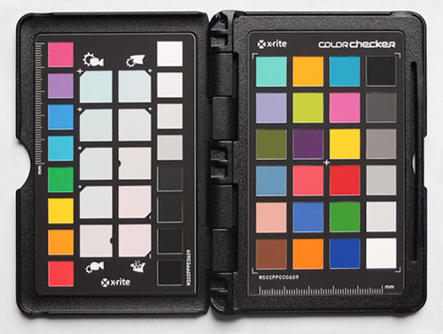
The profiling panel (pictured on the right side) is photographed in a camera
RAW format in two types of light (i.e. tungsten and daylight). The raw files are
converted to Adobe DNG raw files through a program such as Lightroom or Bridge,
then dropped into the XRite program to make a camera profile. This profile then
shows up as a choice in Lightroom when "developing" the raw file. It's very fast
and easy to do, and the results are good.

This kit costs about $100
ordered online.
There may be student discounts, so ask first.
Proofing
Color management with profiles permits making a "hard proof" where you make a
print and "soft-proofing" where you look at color on-screen to see how
a picture might reproduce. Both are commonly used for
estimating how a picture will look when printed on a printing press. This works best when a
printer
with a large gamut (i.e. Epson inkjet) is used to simulate output from a device having a smaller gamut
(newsprint on a printing press). Newsprint has a very small
gamut when compared to Epson prints, so it is easy to "throttle back" Epson output
to match the lesser quality/gamut of newsprint.
Soft Proof
Photoshop from version 6 onward permits soft-proofing on the monitor with the
View>Proof Colors command. It's not as accurate as a printed proof (Hard
Proof) explained later, but you'll find major problems quickly this way without
wasting paper and time.
First, select the profile of the printing process that you wish to soft
proof with View>Proof Setup>Custom. Choose the printing process from choices
available in the Device to Simulate list.
For the classroom example, choose U.S. Web Uncoated v2 as the printing
process. Click the Simulate Paper Color check box to see the effects of tonal
compression that occurs when going to print. The effects are often visibly severe with the
picture looking terribly flat. Writer Bruce Fraser recommends looking away from the
screen for a few seconds before looking to adjust to the new appearance.
Note that only some of the profiles available are modern enough for the
Simulate Paper Color box to work. Older profiles won't have this option, and
soft proofing may not work.
Hard Proof
To make a hard proof, you need access to a proof printer for which you have
printer profiles and for which you can turn off automatic color management.
NOTE: Our VISCOM_RIP printers don't easily allow these modifications in normal
lab usage, so they cannot easily be used to hard proof.
First select the printing process you wish to simulate. As above in
Soft Proofing, select the desired profile that you wish to
proof with View>Proof Setup>Custom. Choose the printing process from choices
available in the Device to Simulate list.
Choose File>Print and make sure that Color Management
is expanded in the drop-down list on the right.
Under Color Handling, select Photoshop Manages Colors.
In the Printer Profile list, choose the printer profile for your printer.
Generally the selection of profile for your own printer is done by selecting the
paper type you wish to print on.
Choose the "Hard Proofing" option where it normally shows
"Regular Printing" in the drop down list.
In the Proof Setup list and choose Current Custom Setup. The Proof
button field should now display the profile selected earlier in your View>Proof Setup>Custom
dialog box. That profile should match the output device you wish to simulate
(i.e. US Newsprint (SNAP 2007) for a common newspaper print job).
Click the Simulate Paper Color box under the Proof Setup list. Simulate Paper
Color is not available with all profiles.
Click the Simulate Black Ink box if the profile permits it. This is not
available with all profiles.
After you press the Print... button, turn off color management in the
printer's own dialog box. Each printer has this in a different location, so consult
your printer's manual for how to find it.
Press print again, and the hard proof should simulate the way the print
appears once printed on a press.
A website containing a more thorough description of Photoshop's color management is
Andrew Rodney's Digital Dog - http://www.digitaldog.net.
This site is chock-full of good color management information. Also on this site are
tips for using custom-made color profiles with Epson printers.
A very good book that describes color management in great detail is
Real
World Color Management by Bruce Fraser, Chris Murphy, & Fred Bunting (Peachpit Press).
Hardware for making Monitor profiles includes:
DataColor's
Spyder measuring pucks bundled with various software from $130 and up.
X-Rite i1 Display Pro. Priced at $240 (B&H).
X-Rite's Color Munki can profile both monitors and printers.
Hardware for reading printer output for making printer profiles includes:
X-Rite - has several models including the
ColorMunki, and the Eye 1
DataColor
- Spyder 5 Studio can create profiles for printers.
Third Party Profiles
Cathy's Profiles - send in a
printed chart on your printing paper and get a profile created. Cost is
$35/profile. Note: Cathy's Profiles appears to be out of business as of
fall 2016.
Miscellaneous
There are some common assumptions and mistakes made in color management.
This section will try to briefly highlight common pitfalls
1) Don't use color working spaces (i.e. AdobeRGB) as a monitor
profile. Color working spaces generally have no relation to the color
capabilities of your monitor.
2) If a file has no profile tag attached to it and is viewed on
a web browser, the browser will assume that the color numbers are for sRGB. The
web began as sRGB, and until recently, was not color managed. Since the late
2000s, browsers and operating systems have begun incorporating color management
capability. This now enables them to properly display the color in an
AdobeRGB-tagged file, for example. However if there is no color profile tag on
the file, the browsers have no way of knowing how to properly display the
colors, and will assume sRGB as a guess.
3) Until around 2016, cell phone displays assumed sRGB too. They
were not color managed. The iPhone started including color management in phone
displays since then, so files including profiles other than sRGB could be
displayed properly.
4) Some web developers need the smallest possible file
sizes for their pictures. Color profile tags require space in the file to store
them. However if a web browser always assumes that untagged files are sRGB, they
take advantage of that. They create sRGB files, then save the files without a
profile. The web browser will assume the untagged file to be sRGB, and the color
is properly displayed as-designed. In Photoshop, the way to save the file
without a profile is commonly done by choosing File>Save for Web. There is a
check box labeled Embed Color Profile, and this can be unchecked if the file is
truly sRGB. To be sure the file is sRGB, there is another check box that is
labeled Convert to sRGB. That will quickly convert any non-sRGB files the user
might be working on.
5) Different "rendering intents" are available when printing or
changing profiles. See the Rendering Intent page
for an explanation of what they do. For photos, generally Perceptual or Relative
Colorimetric are the smart choices to use.
Extra archived info - not part of the class material
Typical Color Managed Workflow for Printing to Desktop Epson Printers
(not the RIP printers)
1) Calibrate your monitor using one of the steps outlined above. A hardware calibrator is
best, but more expensive.
2) Choose a suitable working space. Adobe RGB (1998) is a good choice for quality printed
output and should be the default in the VisCom labs. Use sRGB for web work only.
3) Obtain a good color profile for the printer plus paper type that you will use. Install
it in the Library>ColorSync>Profiles folder (Mac), or the
Windows>System32>Spool>Drivers>Color folder (Windows XP). Each paper type requires a different profile. Epson's standard
printer driver installs some canned profiles and uses them automatically at print time, but these canned
profiles range from very good to fairly bad. Custom-made profiles for individual printers
are often much better.
4) (Optional) Obtain a profile for your scanner or your camera. remember that there is no such thing as "typical" light when
photographing because conditions vary so widely. Using a scanner or camera profile is often omitted
because any off-color casts can usually be fixed in Photoshop anyway using a
calibrated monitor.
Once the system is setup as in the above steps, scan the artwork in RGB (not CMYK!) and
edit the tones in Photoshop. You will be editing in the RGB color working space Adobe RGB
(1998) which has a wider gamut than sRGB and therefore can contain more colors. Epson
printer drivers require RGB data, so don't convert the picture to CMYK.
Once you are ready to print to the Epson printer, you can apply a custom printer
profile one of the following ways. Use only one of them or you will double-correct your
file and end up with odd colors. The following steps are specific to the Epson 1270/870
printers once found in the VisCom lab and the examples depict using a profile for Epson Photo
Quality Inkjet Paper. If you are using Epson Photo Paper, substitute the profile named
1270PP.ICM for the profile depicted in the examples. Click
here for a list of profiles for the older printers once found in the VisCom lab.
Method 1. Use Photoshop's
Convert to Profile command. (Edit>Convert to Profile). This requires
turning off the Epson printer driver's internal color management when printing. This
method manually applies a color profile before print time from within Photoshop. It works
on both Macs and on PCs and with all printers. NOTE: 2010 Update: Avoid this
method for most current inkjet printers. It is useful when using a non-standard
printer like a FUJI Pictography 4000 that uses File>Export for printing instead
of File>Print. In this case, it's the only way to apply a printer profile.
Method 2. Use the
Printer Profile drop-down list in the Photoshop "Print" dialog box.
(File>Print. Choose the Color Management button
(toggles between Color Management and Output), choose a destination profile in the Printer
Profile list. This requires disabling the Epson printer driver's internal color management
in subsequent steps. Works with Macs and with newer printers under Windows 98, and Windows
XP.
It is important to realize that only one method should be used when printing. If you
apply a profile twice, colors can shift unpredictably.
Archived Workflow Examples for the Curious:
Typical Color Managed Workflow for Printing for the HP 8500 Color Laser
Printer.
Follow this link. It is also linked from the Other Digital Information News and Information page.
Typical Color Managed Workflow for Printing to the HP 5500 Color Laser Printer.
Follow this link to a page showing printing steps from
different programs.
Short Instructions for Printing to an Epson 870 using Epson
Premium Glossy Photo Paper
This simplified set of instructions works using Method
2 above. Be sure to use Premium Glossy Photo Paper from Epson - other papers require
different settings.
