Meeting 9
Meglio un uovo oggi che una gallina domani
Topics: Color correction in Camera RAW, Halftones, Scanning issues
Files needed for today:
| Exercise Folder | Filename |
| #4 | _D2X6738.NEF |
| #8 | fredrichs central park.CRW |
| #4 | luna night shots-19t.jpg (optional) |
| #6 | (optional) VueScan comparisons folder |
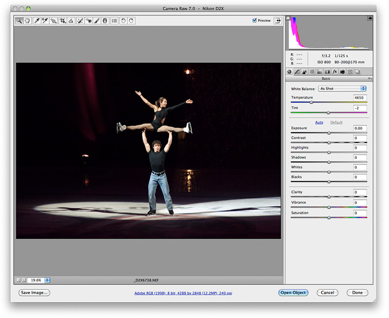
Toning in Camera RAW
Color correcting pictures well requires a basic understanding of color relationships
and a practiced eye.
Understand complementary colors. Complementary colors are those opposite each other on the color wheel. To view the color wheel, click here.
How good is your color perception?
FACT: 1 out of 255 women and 1 out of 12 men have some form of color vision
deficiency.
Open this XRite
web link
to take an
online interactive test based on the official FM100 Hue Test to see how good
your own color vision is.
Note that if you have camera RAW files available, you should do the majority of the toning in the RAW software to avoid the data loss and resulting quality problems that arise from toning ordinary RGB-mode files (i.e. JPGs, TIFs, etc.) in Photoshop. Toning in RAW software never changes the RAW file itself and is reversible at a later date. Once file is "baked" into a Photoshop file, or saved as a JPG, TIF, etc. file, then further toning results in non-reversible changes. Aggressive toning with these can produce quality issues.
Another reason for toning in RAW is that you are working with a higher bit-depth file (normal bit depth = 8 bits per channel) that permits greater adjustment without posterization or increased noise. You can work in higher bit depth TIFs and JPGs in Photoshop, but be sure that you re-convert it back to 8 bit/channel for use in publication or printing, etc.
Finally, RAW files contain hidden information at the extreme dark and light ends of the tonal range, but Camera RAW adjustments may be able to bring them out. You might be able to save a photo with blown-highlights, for example.
You can search the web for additional features not included in this brief introduction to Camera RAW. There are many additional things to discover.

When you first view a camera raw file in Adobe Camera RAW, you are presented with a view of your picture as-shot, and a number of controls along the right pane. In addition, other tools arrayed along the top of the window let you dodge or burn, remove spots, crop and more. At the bottom (and usually shown in blue text) are the workflow options as currently selected.
Click the links below to jump to explanations for some different sections of the Camera RAW program...
Main window
Adjustment brush
Graduated Filter
Color Sampler
Spot Removal
Workflow options
There are other toning options in addition to the linked tasks shown above. For example you can reduce noise, or correct for chromatic aberration of lenses in the various tabs shown near the top of the right-hand side control panel.
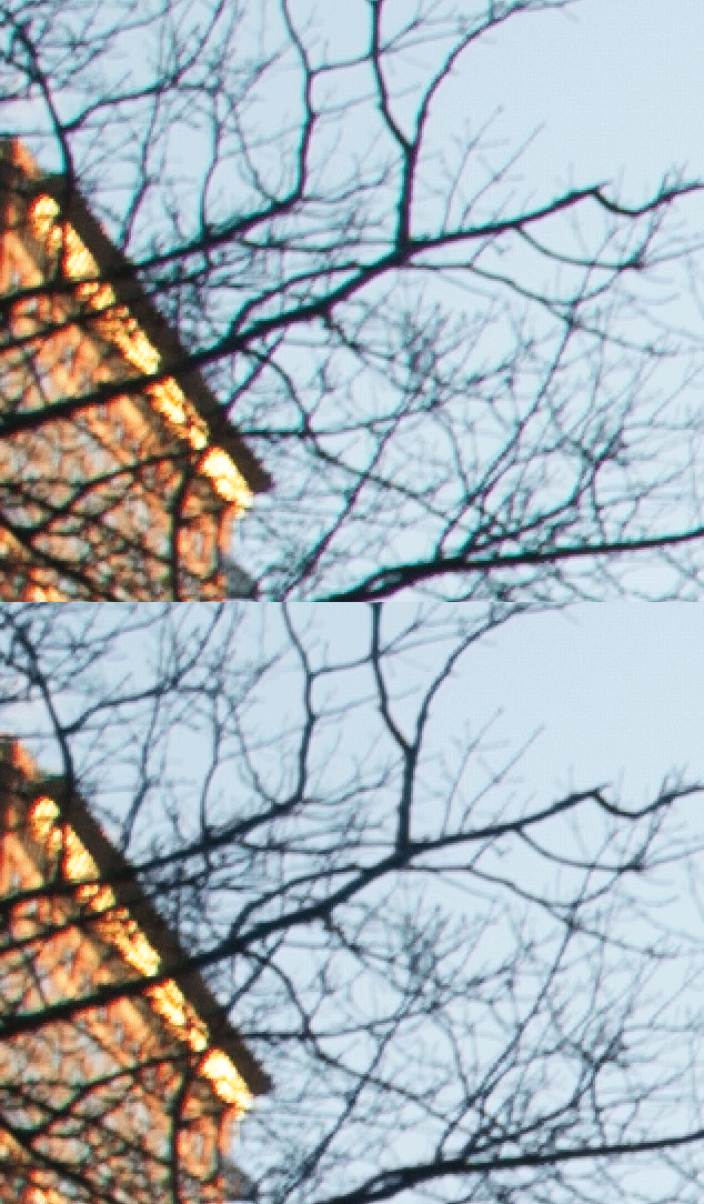
To demonstrate how chromatic aberration, a lens fault, can be improved, open fredrichs central park.CRW. Zoom in on the tree branches in the upper left corner, and note the color "fringe" around them. Click the Lens Corrections tab above the controls on the right. Look for the Defringe section of the Lens Corrections controls.
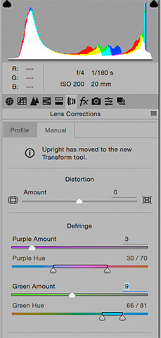 |
The Lens Corrections dialog box
found by clicking on the lens icon tab located just under the historgram. The Defringe section removes color from edges of items like the before/after animation below. Note the false color on the edges of the branches, and how it is removed after using the Defringe control. The Purple and Green Amount sliders control how much of the color is removed. The Purple Hue and Green Hue sliders let you select which false colors you want to remove. In the picture below, the Purple amount removes the purple from the underside of the branches with the Purple Hue set to the default colors. However the Green Amount does nothing until the Green Hue is moved more toward the cyan end of the slider to match the fringe color actually showing in the picture. The net effect of this adjustment is a subtle sharpening of the picture. Note that inexpensive lenses produce more chromatic aberration than better lenses. Zooms will also be more prone to it. Note also that under the Profile tab in this section of camera RAW, you can take advantage of the database of corrections for various lenses to have corrections applied automatically. Before experimenting with corrections found in the Manual tab, try going to the Profile tab and click the Remove Chromatic Aberration box. It might save time. |
Can Toning Be Overdone?
Some examples...
https://www.google.com/search?sourceid=navclient&aq=&oq=patrick+schneider+firing&ie=UTF-8&rlz=1T4GGHP_enUS518US518&q=patrick+schneider+firing&gs_l=hp...0j0i22i30l4.0.0.0.5162...........0.MXkYJDIUepM
Halftone screens
When printing on most commercial printing presses, intermediate tones between
the white of the printing paper and the ink colors must be "faked" by using various sized dots of ink.
For example, consider the case of a grayscale picture printed on a press using
black ink. There is no gray ink, so the gray tones are made up of small black
ink dots surrounded by white paper areas. Our eyes can't resolve the individual
dots at normal viewing distances, so the small black dots and surrounding white
areas merge together create the perception of a gray tone.
While it is desirable to create a very small halftone screen (measured in Lines Per Inch - LPI), the real-world constraints of the paper used and press capabilities limit how fine the screen can be.
How much resolution?
Questions often arise from students about how much resolution should be used
for printing or for web usage. The answer is "it depends". The usage of the
picture (and the picture type) determines how much resolution is needed to do a
good job.
Commercial Printing
The goal when printing halftones on a printing press is to provide a final sized digital file that has a resolution of 2x the halftone screen used for printing. For example, if a picture will be published in a newspaper printed with an 85 lines per inch halftone screen, then it must be 2x85=170 pixels/inch AT THE PRINTED SIZE. The equations in the handout include a term to adjust for enlargement or reduction of the original art. Remember though that at final size, the resolution of the picture must be double the halftone screen used when printing. Different papers and printing presses will employ different halftone screens, so a freelancer must ask questions of the printer to determine what screen will be used on a job.The goal when printing line art is to provide a final sized digital file that has a resolution of at least 600 pixels/inch (or possibly more for adequately reproducing very fine lines).
The handout equations include terms for how much an original is scaled to reach the desired printing size.
Because laser printers use screens similar to commercial printing, the same formulas can be used. Most laser printers have a fairly coarse halftone screen of around 85 to 100 lines/inch though, so 2x100=200 pixels/inch is about all the resolution they can use at the printed size. Increasing the size of the picture file beyond that will not increase quality because of the mechanical limitations of the printer.
Inkjet Printers
Desktop inkjet printers (Epson, Hewlett-Packard, Canon, etc.) don't use a traditional halftone screen, so we can't use the traditional formulas for them. These printers use a random dot halftone pattern. Because of that, the calculations in the scanning handout won't work. However, we have found quality color or grayscale photos require 200 pixels/inch at the final size. Some users report small gains in quality by going up to 300 pixels/inch, but anything above that won't make much of a difference because of mechanical limitations of the printer.For inkjet printers, line art still requires more resolution at the reproduction size than photos. Try for the same 600 pixels/inch specification given for commercial printing.
The Web and Email
Resolutions are generally much lower for screen usage (i.e. web, email) than for commercial or inkjet printing. The old web standard (but still often quoted) is 72 pixels per inch at the size you want it to be on screen. However modern computer displays have increased resolution compared to early monitors, and that permits an increases in the picture resolution. I now assume around 100 pixels/inch for my own web work because most modern screens have very close to that resolution. Remember though that the number of pixels (height and width) is the most important aspect of pictures for the web, and that the web generally ignores resolution tags. The quoted resolutions are a way to keep beginning web designers out of trouble, and to make a viewable-sized print if a user chooses to print it. The quality though will be insufficient for commercial work, but perhaps serviceable for refrigerator-bound snapshots.To summarize for pictures that don't need any resizing:
Printing process Color/grayscale photo Line Art Commercial printing press line-screen (lpi) x 2 600 pixels/inch min. Inkjet or laser printers 200-300 pixels/inch 600 pixels/inch Web or email 72-100 pixels/inch (but think pixels)* 72-100 pixels/inch (but think pixels)* *ultra-high resolution Retina displays will require even more pixels for a given picture size, and demand a different approach to web coding to accommodate the old and the new.
Note that the resolution goals mentioned above apply to digital camera pictures as well as scans of film, prints, or other artwork. In that regard, digital camera pictures and scanned film require the same treatment.
Resizing pictures to fit the size demands of a layout
If you have to resize a scan or digital camera picture to fit a layout, the size
ratio can be used in a formula to modify the values in the table above. I have
two formulas for commercial printing in the Scanning Resolutions and Scanning Tips
handout (Available in Acrobat PDF
format in the Handouts section of this site.)
The size ratio multiplier in the handout is calculated by reproduction width
÷ original width, and can be applied to any of the
printing or electronic processes.
The scanning handout provides formulas to use when preparing digitized pictures for publication regardless of whether the picture was scanned from film, a print, or directly captured with a digital camera. The underlying goal of these formulas is to provide enough pixels to print well, but not so many that the workflow is slowed.
Scanning
Scanning is a way of digitizing pictures for use
on the computer and for printing. VisCom owns Nikon LS-4000 (not currently
deployed in the classroom - for checkout only, see me) and Epson scanners.
Note that Nikon has never updated their Nikon Scan software for newer Macs, and it won't run now. To still be able to use the scanners, we now use VueScan as the scanning software to run the Nikon film scanners. VueScan software is used to run our Epson scanners too. See Bill Schneider if you wish to check out a Nikon film scanner for 35mm negatives or slides.
Have an Obsolete Scanner or Problem Negatives?
If you have a dense negative or have continual problems with excessive contrast in your
scans, try using different scanning software. VueScan software has saved many a problem
negative for me using my older Nikon LS-1000 and even a newer LS-4000.
http://www.hamrick.com
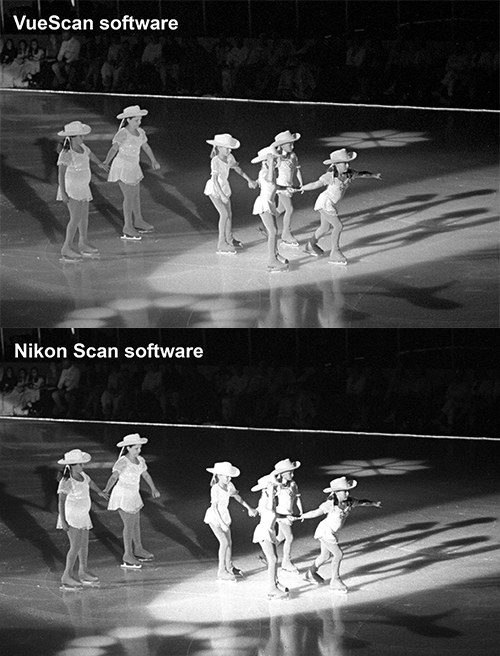
The VueScan comparisons folder in Exercises 6 contains some comparison examples of difficult scans made using stock Nikon software vs. VueScan. These scans were from b/w negatives made in contrasty stage lighting which often blows out highlights in any scan made with the original Nikon software. [Note that photographs made with digital cameras may have a short exposure range between highlights and shadows and can also blow out highlights easily. Film may be better in this regard if it is processed for a wide exposure range ("pull" processing), and the scanner/software can handle it.]
Picture copyright ©William R
Schneider - All Rights Reserved
Comparison scans of a 35mm Tri-X negative exposed in contrasty lighting.
The animated GIF file above shows how the Nikon Scan software blew out the highlights (bald whites), making it impossible to display them regardless of the tools in Photoshop. The VueScan version has lower contrast, enough to keep highlight detail visible. It also opens up the shadows a little too. With both the highlights and shadows contained in the file, I could bump the midtone contrast a bit, if desired, without losing the darks or lights. It's a far better scan to use for final toning steps.
Another great benefit of VueScan is that it lends life to old scanners that are no longer supported by the manufacturer. Changes in operating systems and applications too often leave a two or three year old scanner an orphan. VueScan works with most modern OSes and provides a way to continue using an expensive scanner. A trial version of VueScan is a free download to experiment with.